Salaath Shaikh®

Before Upstox · Tata CLiQ

Beauty, luxury and a marketplace

Before Upstox I designed for the Tata CLiQ family of shopping apps. These are four of the projects I’m proudest of, from a beauty homepage that changes with the season to the portal sellers use to get listed.
Homepage orders · Palette
+11.5%
Conversion · Luxe editorial
+6.5%
Filter use · Marketplace
+29%
Seller onboarding time
−60%
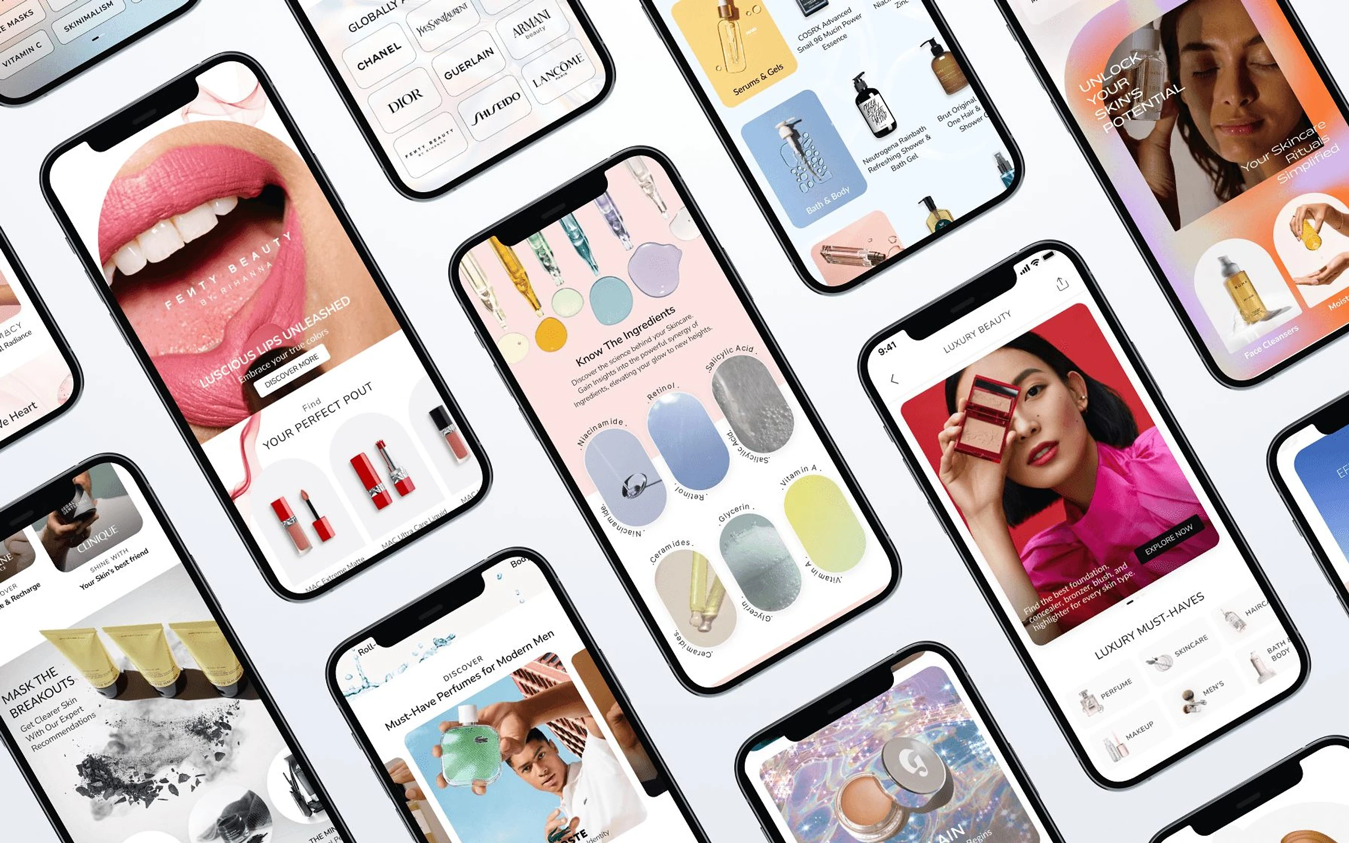
A grid of Tata CLiQ Palette app screens

[ Tata CLiQ Palette ]

A homepage that can dress up for every sale

Palette had just gone from content-led social commerce to a full beauty store and the homepage couldn’t keep up with brand deals or big sale events. I designed 15 modular components that let the team re-theme the whole page for any season.
Timeline
4 weeks
Role
UI/UX, creative direction
Platform
iOS, Android, m-site
Client
Tata CLiQ Palette
Shipped
15 components, on every platform
Presented to
CEO and Business Head
5.2 LPeople using Palette every month
1,000+Beauty brands on the store
4.6App Store rating, out of 5
4.3Play Store rating, out of 5

[ Before ]

A social feed, asked to do a store’s job

Within four months of its national launch, Palette went from a content-led social app to a full beauty store. The homepage was still a feed of guides and posts.

  1. 01

    Brands had no good place to pay for

    The page had few formats a brand could sponsor, so brand deals were hard to sell.

  2. 02

    It could not dress up for a sale

    Big events like Diwali needed a different page. The old one could barely change.

  3. 03

    Thumbnails came in one size

    Quick links and carousels were locked to fixed sizes.

  4. 04

    Parts could not be combined

    There was no way to join components into one large category or brand showcase.
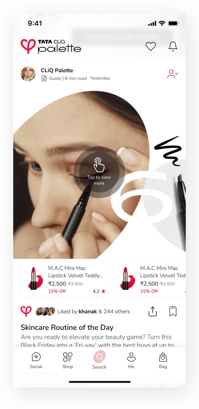
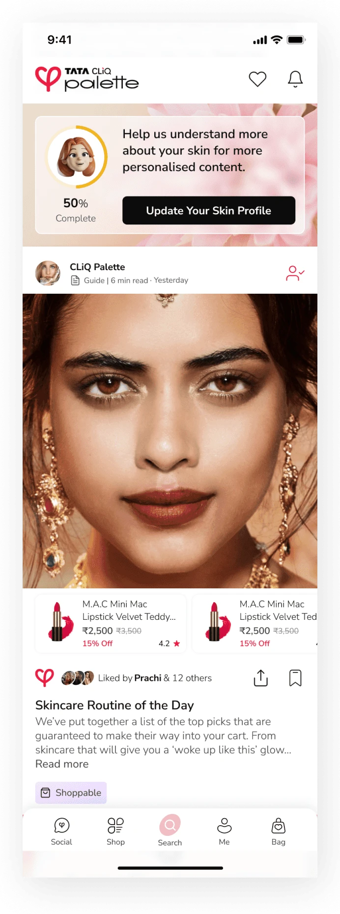
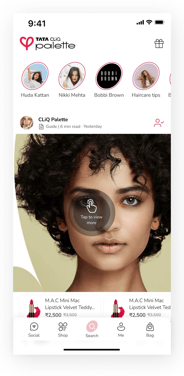
The Palette homepage before the revamp
Before · Existing homepage
After

A homepage built from 15 parts that can change shape

Soft backgrounds, a light glass effect and strong imagery, with room for GIFs and video.
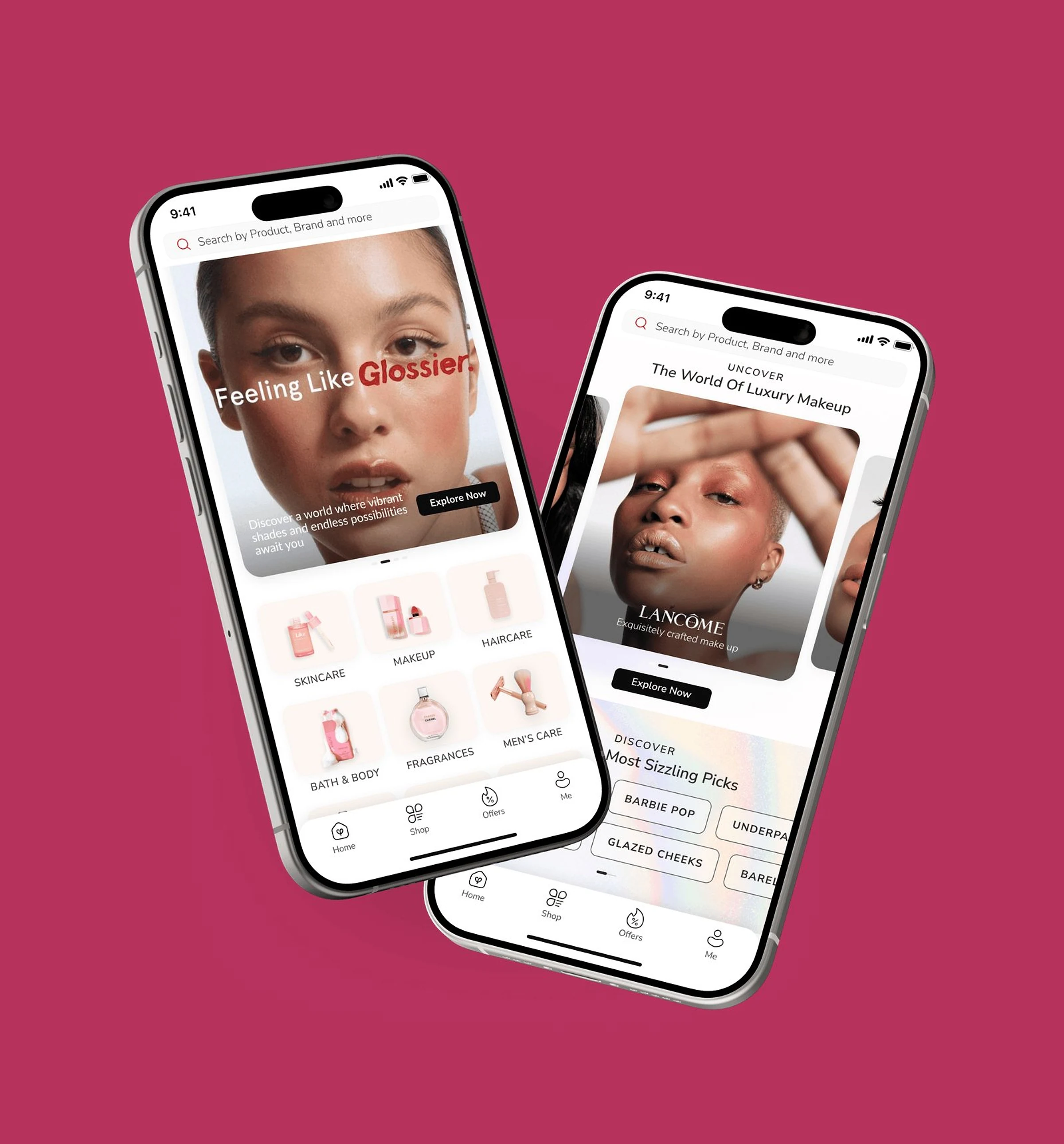
Palette homepage with a Glossier banner and a Lancôme carousel
Sale theme · Homepage
Homepage orders, first 30 days
+11.5%
New components, each with variants
15

Banners, carousels, brand rails, category grids and more, all themeable.
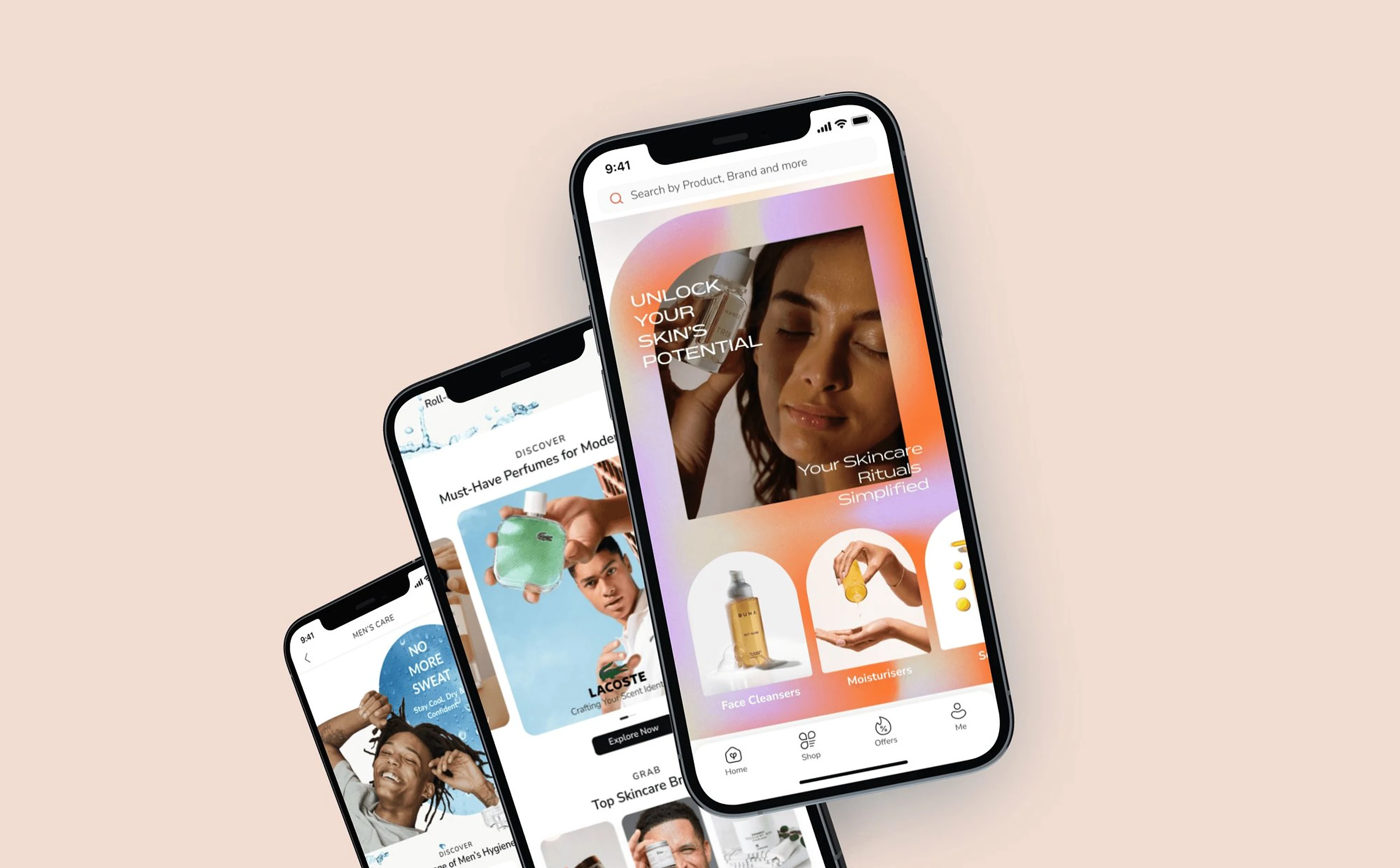
Palette screens with glass-effect banners
Glass banners · Skincare
Launch timing

Live right before Diwali, Black Friday and wedding season

Shipping ahead of the peak sale season helped the team reach its annual sales target.

Same components, four looks

One set of parts, a different store each time

Each category got its own vision and visual theme, built from the same 15 components.

  1. 01Homepage
  2. 02Skincare
  3. 03Men’s care
  4. 04Luxe beauty

Theme 01 / 04

Homepage

Vision
Discovery and inspiration in balance
Look
Playful, with soft colour and strong imagery
  1. 01Homepage
  2. 02Skincare
  3. 03Men’s care
  4. 04Luxe beauty

Theme 02 / 04

Skincare

Vision
Show expertise and teach routines
Look
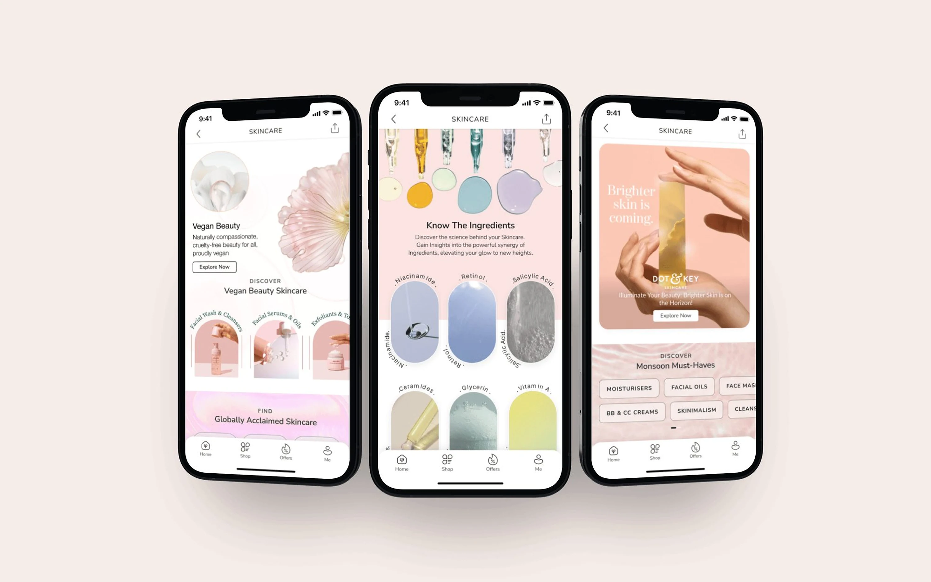
Fresh, soft colours, real skin, ingredients up front
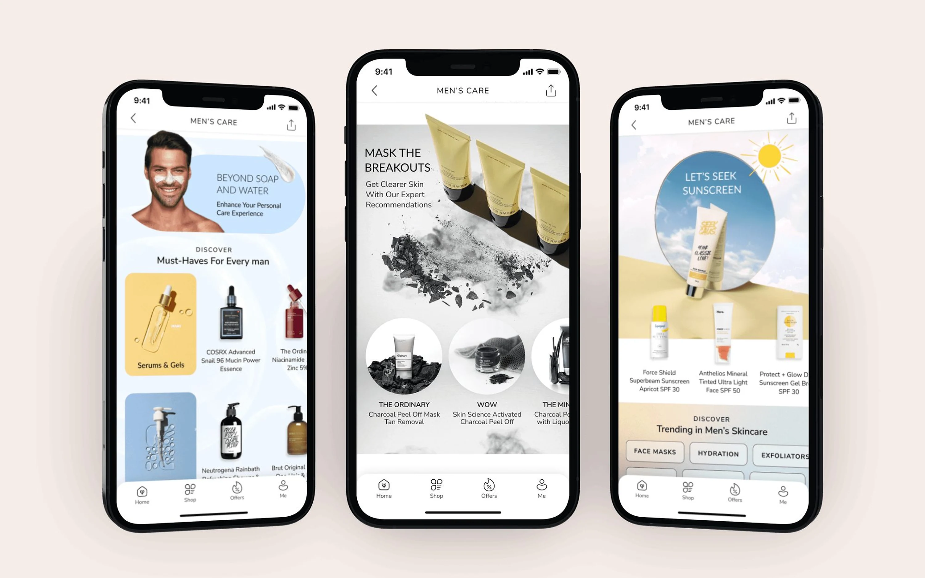
  1. 01Homepage
  2. 02Skincare
  3. 03Men’s care
  4. 04Luxe beauty

Theme 03 / 04

Men’s care

Vision
Shop by concern, get to the product fast
Look
Relatable imagery and fresh colours
  1. 01Homepage
  2. 02Skincare
  3. 03Men’s care
  4. 04Luxe beauty

Theme 04 / 04

Luxe beauty

Vision
Bold and aspirational
Look
Whitespace, subtle colour, brands shown at their best
Three Palette Skincare screens
02 / 04

Skincare

Fresh, soft colours, real skin, ingredients up front

Three Palette Men’s care screens
03 / 04

Men’s care

Relatable imagery and fresh colours, built around the product
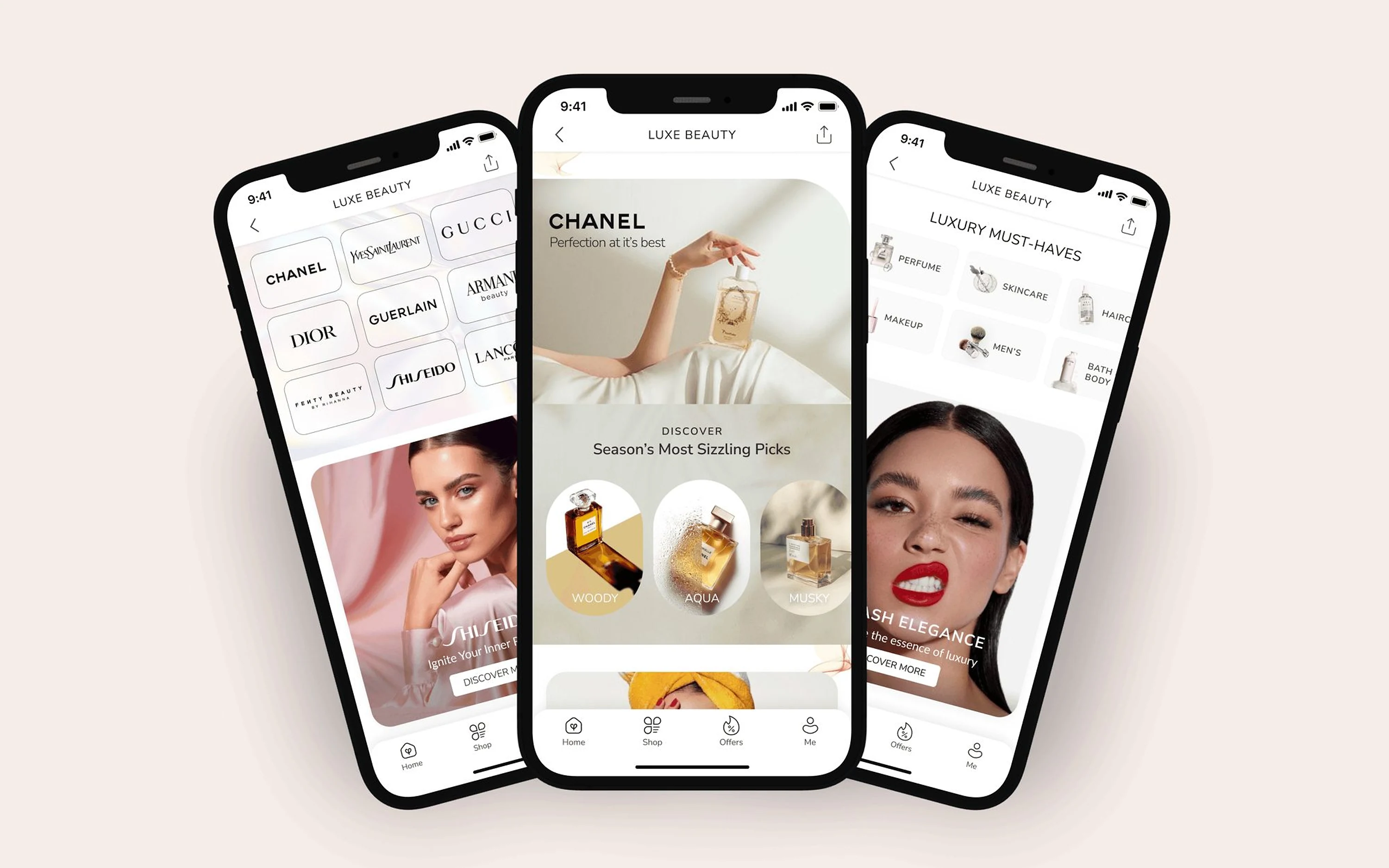
Three Palette Luxe beauty screens
04 / 04

Luxe beauty

Whitespace, subtle colour, brands shown at their best

[ Tata CLiQ Luxury ]

Slow commerce: a magazine you can shop from

Luxury wanted a place for stories, videos and podcasts that still led to products. We added an Editorial tab to the main navigation, with long reads, shoppable looks and short stories.
Timeline
8 weeks, design and build
Role
UI/UX, creative direction
Platform
iOS, Android, m-site, desktop
The Luxe Life tab in the app
A shoppable short story
A celebrity-style article
A home décor article
+6.5%Product conversion after the tab launched
+12%Average time people spent in the app
5 minAverage time on gifting stories, the most-clicked topic

[ Tata CLiQ Marketplace ]

Filters people actually use

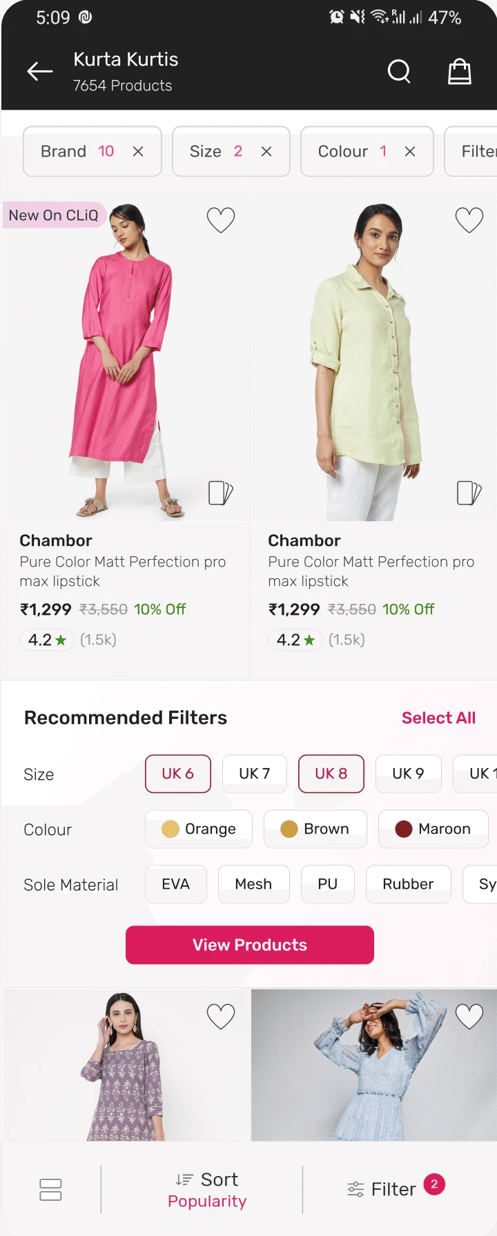
Filters on our listing pages were hard to find and slow to use. After research and testing, we rebuilt the panel with multi-select and smarter filters right on the listing page.
Timeline
12 weeks
Role
Research, UI/UX, usability testing
Surface
Product listing pages
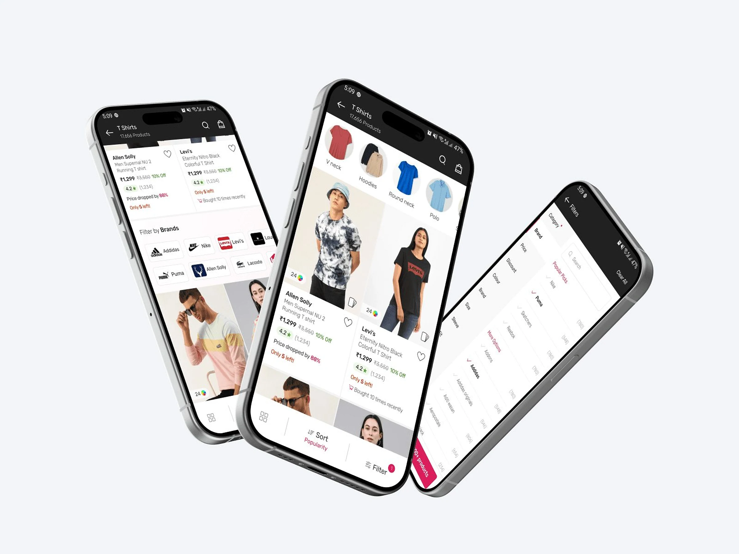
Three phones showing the new filters on product listings
+29%Growth in filter use, from 19.5% to 25.1% of shoppers (Q4 ’21 → Q3 ’22)
+5%Click-through on filtered results, from 77.7% to 81.6%
6.8%Conversion for shoppers who filter, up from 5.5%. Shoppers who didn’t filter converted at 3.2%

[ Final design ]

Filters that come to you as you scroll

01
Recommended filters
A panel inside the listing suggests sizes, colours and materials. Pick several, then view the products.
02
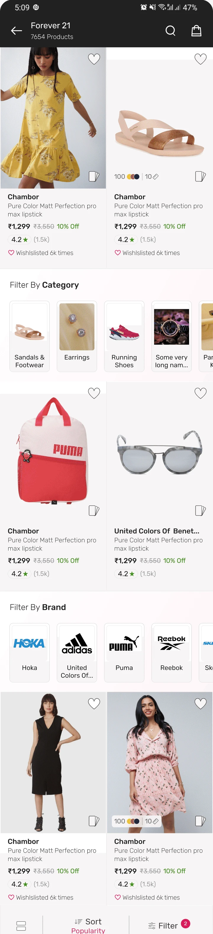
Visual filters
Categories and brands appear as picture tiles between the products, so narrowing down takes one tap.
Recommended filters on a product listing
Visual filters on a product listing
Four quarters on

More people filtered and those who did bought more

Filter use

25.1%from 19.5%

Share of shoppers who used a filter

19.5%Q4 ’2119.8%Q1 ’2221.7%Q2 ’2225.1%Q3 ’22
Click-through

81.6%from 77.7%

Shoppers who filtered, against those who didn’t

77.7%62.1%Q4 ’2179.6%64%Q1 ’2280.7%65.5%Q2 ’2281.6%63.9%Q3 ’22

Used filtersDid not

Conversion

6.8%from 5.5%

Shoppers who filtered, against those who didn’t

5.5%3.5%Q4 ’216.4%3.8%Q1 ’226.1%3.5%Q2 ’226.8%3.2%Q3 ’22

Used filtersDid not

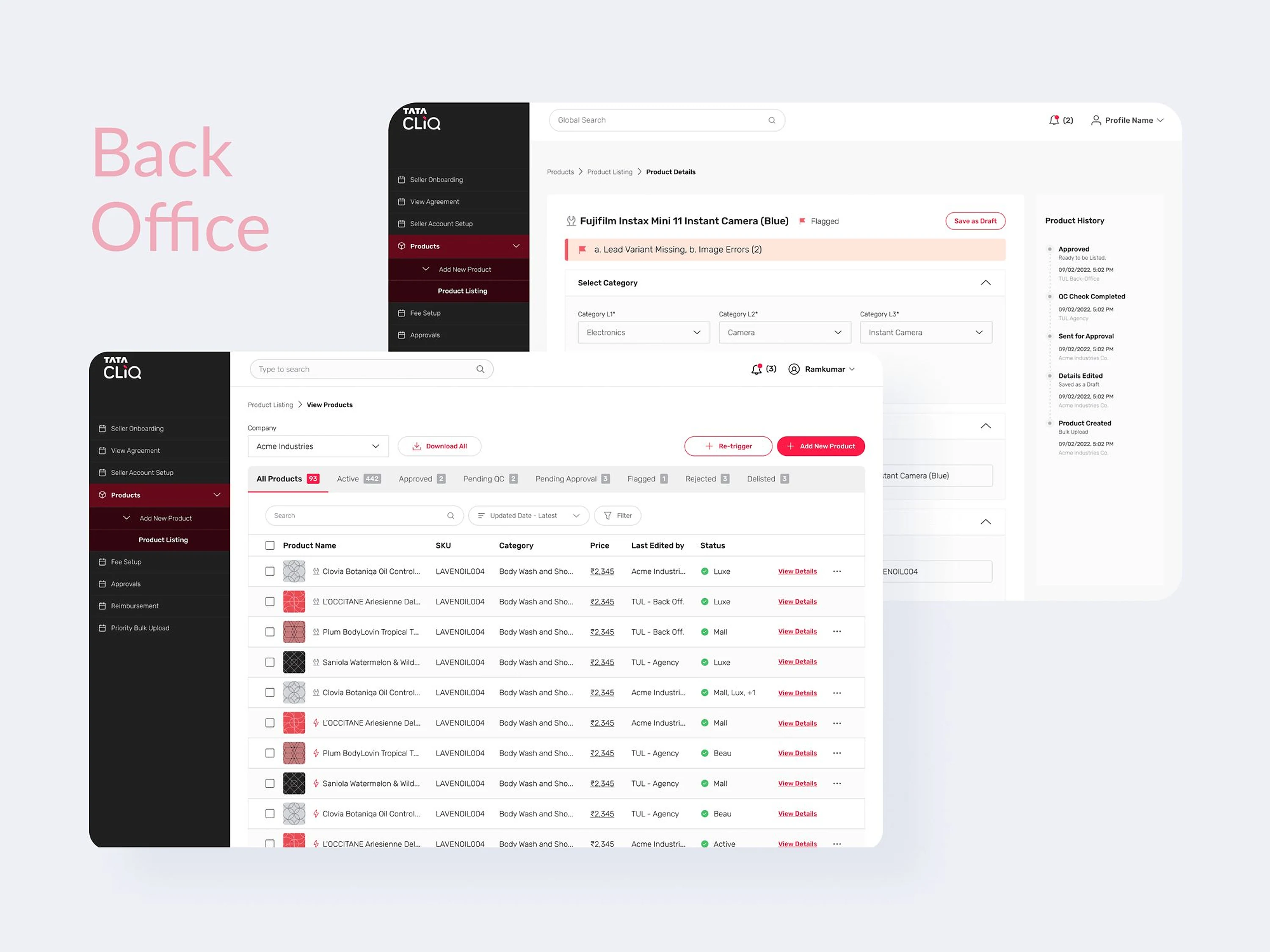
[ Tata CLiQ Seller Portal ]
From weeks of email to onboarding online

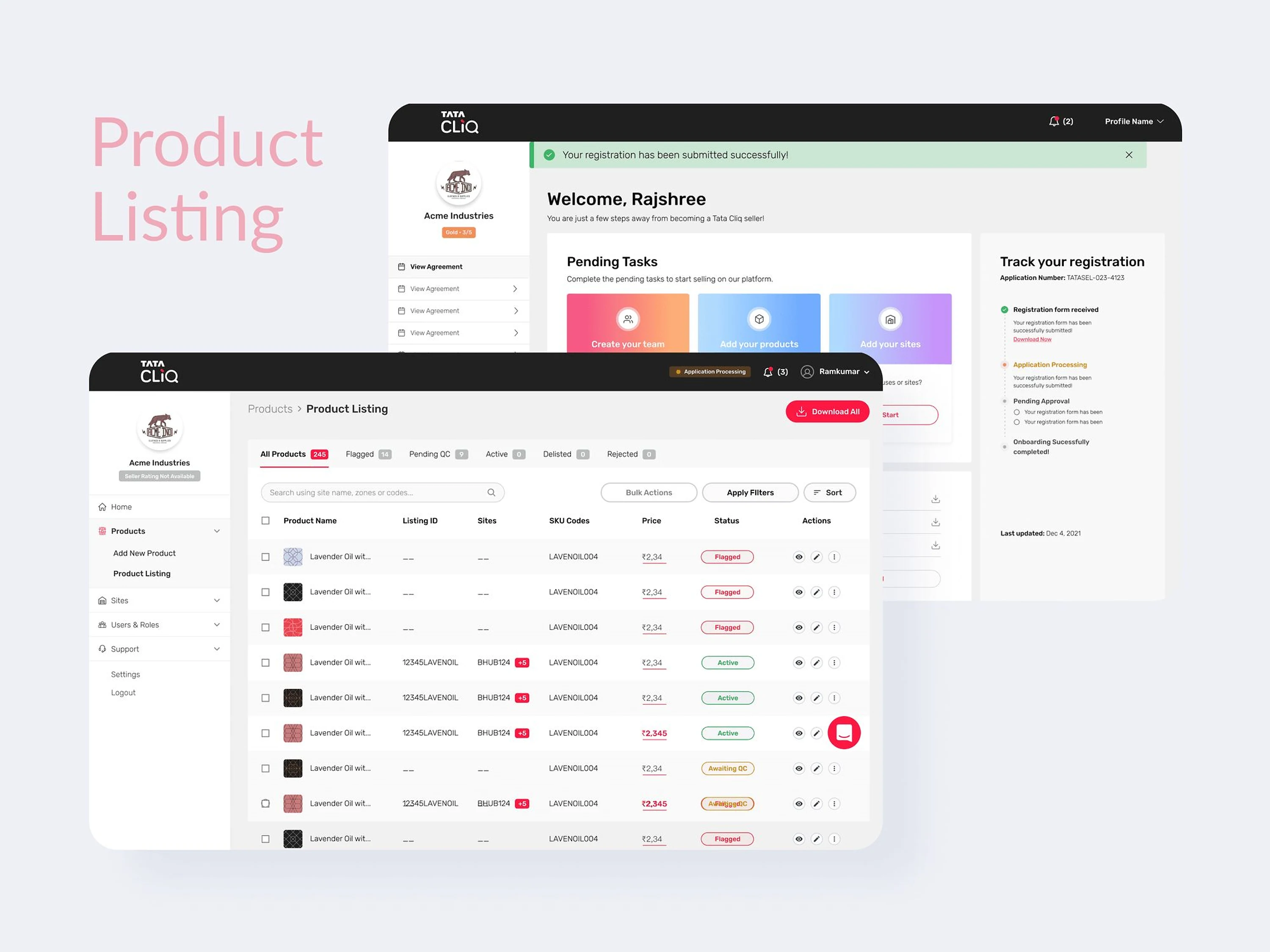
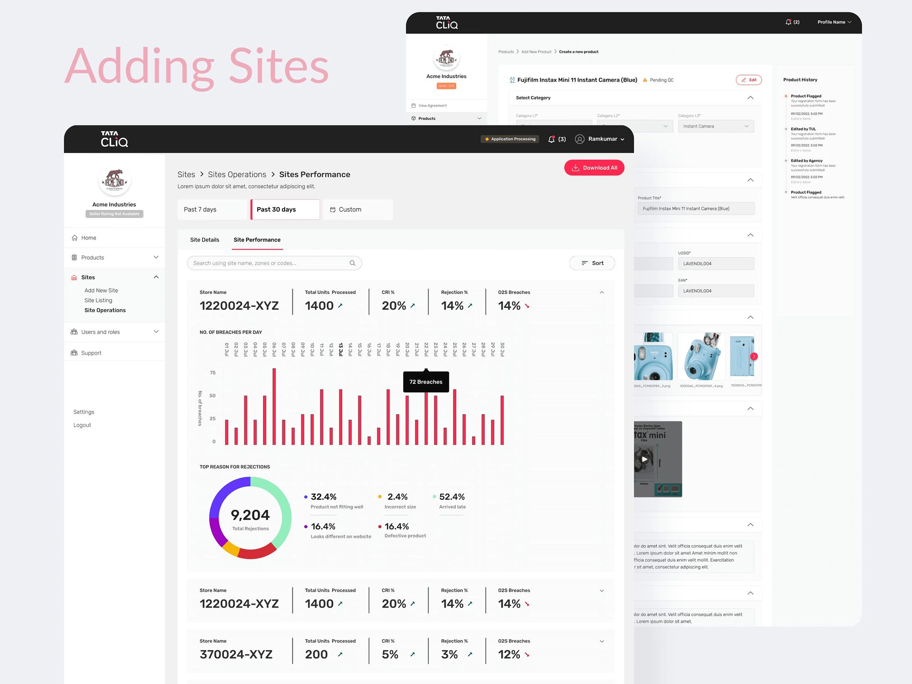
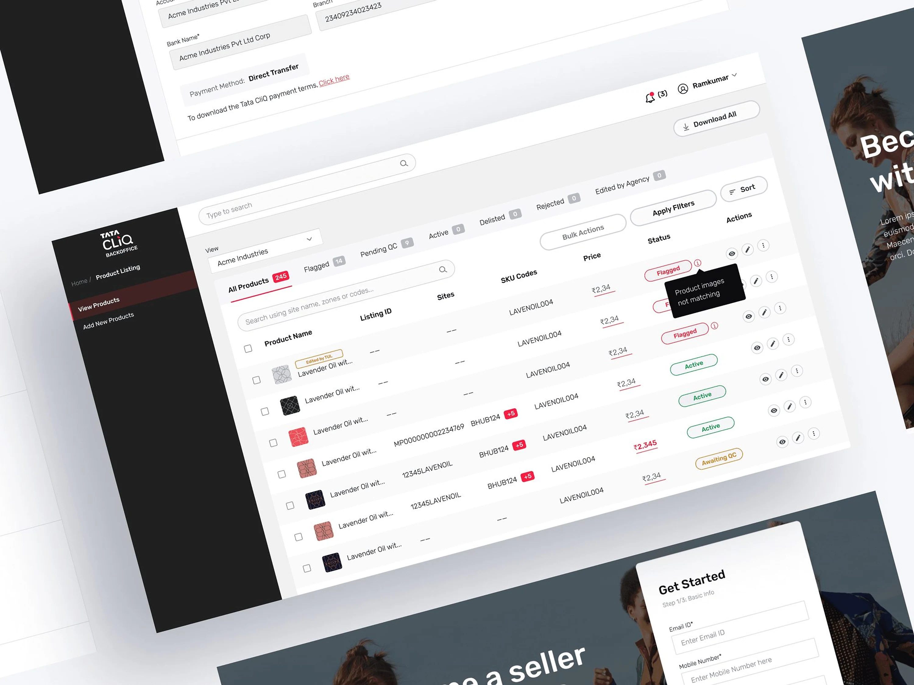
Getting a new seller live took weeks of calls and email between sellers, account managers, finance and legal. Seller Portal 2.0 put sign-up, approvals and product listing in one place, with steps running side by side.
Timeline
3 months
Role
Research, UI/UX, usability testing
Platform
Desktop
Seller Portal 2.0 dashboard and sign-up
−60%Time it takes to onboard a seller
25–30Days it used to take a seller to reach their first listing
4Flows redesigned: sign-up, onboarding, back-office approval, listing
Product listing screens
Site performance dashboard
Back-office approval screens

[ Back to Upstox ]

2026

How we cut demat account opening from 12 minutes to 2

Revamping Upstox’s account-opening journey by replacing repetitive form filling with automated verification, fewer steps and a simpler path to investing.

~65%
Conversion
~2–3 min
Time on the happy path
~38%
Fewer onboarding steps
Sal · Lead product designer, UpstoxBefore Upstox · Tata CLiQ
Salaath ShaikhPortfolio — 2026
Loading the work000