[ Selected work — 01 / Upstox ]
Turning a 12-minute demat account opening process into a delightful 2-minute experience.
How we reimagined Upstox’s account-opening journey, replacing tedious form filling with automated verification, fewer steps and a simpler way to start investing.
- Role
- Lead product designer
- Timeline
- April – May 2026 · 45 days
- Released
- October 2026
- Team
- Salaath Shaikh — Lead Product Designer Sathvik — Product Designer Sydney — Product Manager Engineering — Cross-functional team
[ The problem ]
We had redesigned account opening twice. People were still dropping off.
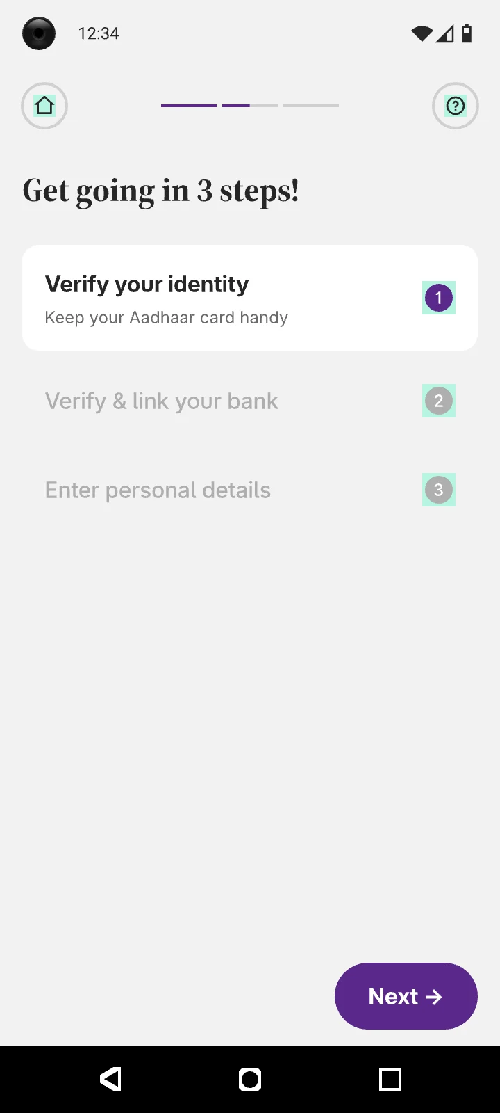
Before anyone can buy a share, they finish KYC: PAN, bank, personal details, signature, selfie and an Aadhaar eSign. Each earlier version fixed the thing it thought was wrong.
Too much on every screen
Dense forms, several questions at once, long declarations. 24 steps and every one looked like work.
Less on each screen, more screens
We went after cognitive load: one question per screen, a primer before each section, lots of visual help. Every screen got easier. The journey got longer.
Watch it to feel how long it goes on.
Every tap on the happy path, recorded in the Figma prototype. Filling it in for real took 10–12 minutes.
After Version 2.0 launched in September 2025
[ Where that left us ]
Every screen was easier to get through. The whole journey still felt long.
[ The investigation ]
The biggest drop wasn’t at the end. It was at PAN verification.
Where people left
Hover a circle or a step to see what it asked people to do.
- Mobile & email0.3%
- Verify PAN59%
- Signature0.7%
- Bank verification3%
- Segment activation3.7%
- Personal details0.7%
- Add nominee0.7%
- Selfie1.1%
- eSign2.3%
What Verify PAN asked for
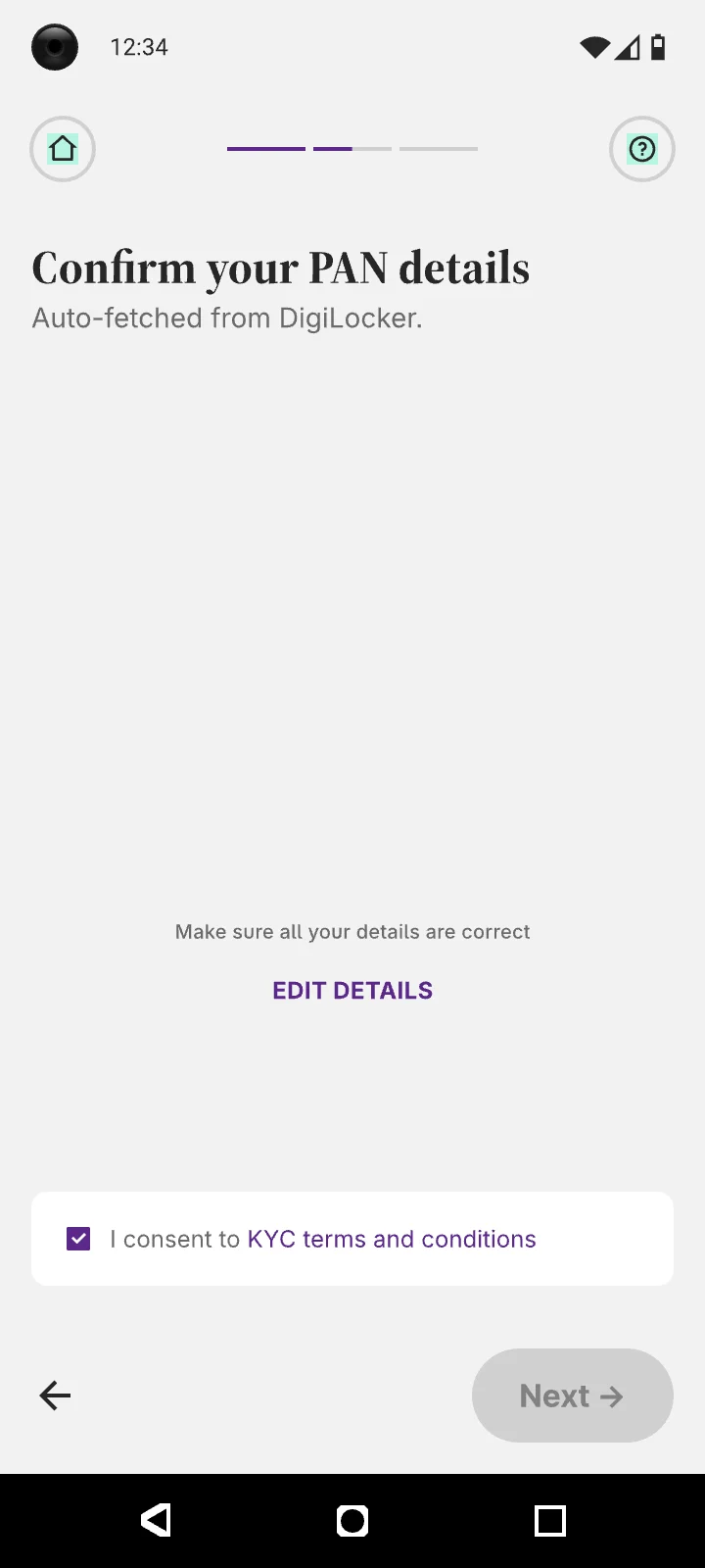
Right after sign-up, with no warning that KYC was coming: a DigiLocker login with its own OTP, a consent screen, then a PAN typed in by hand and checked.
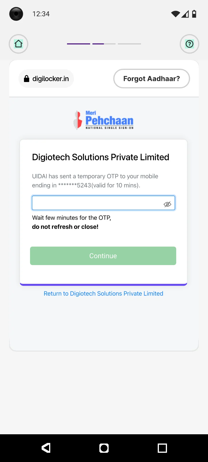
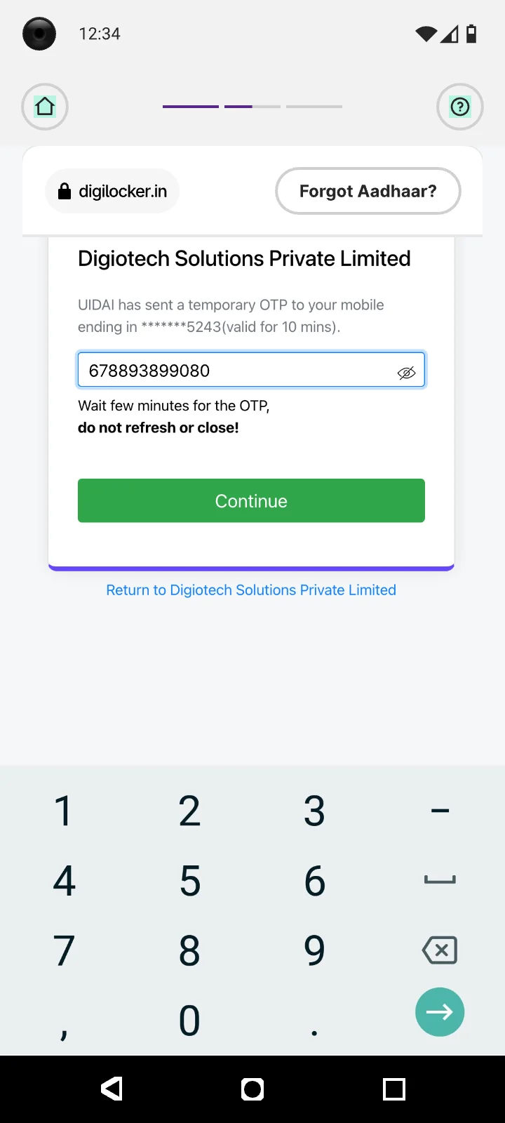
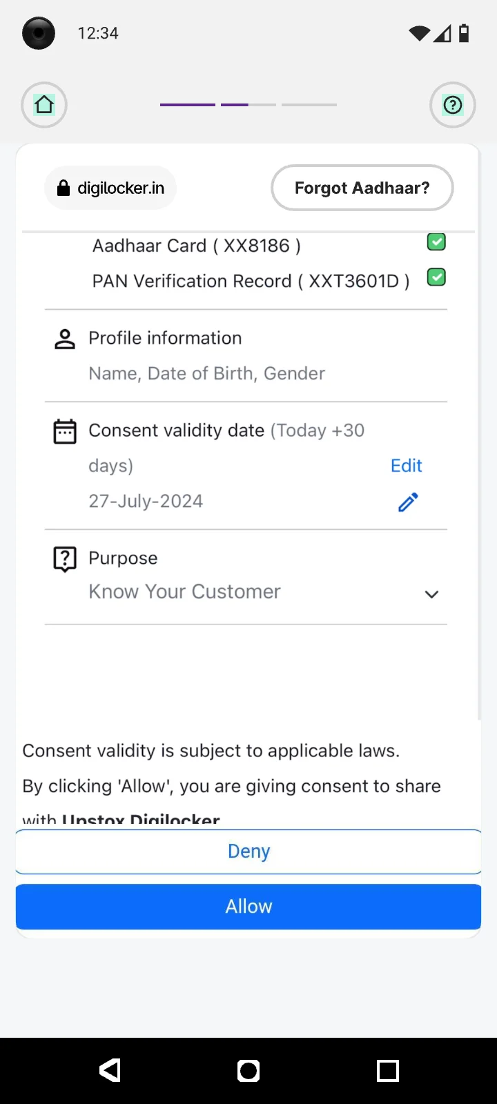
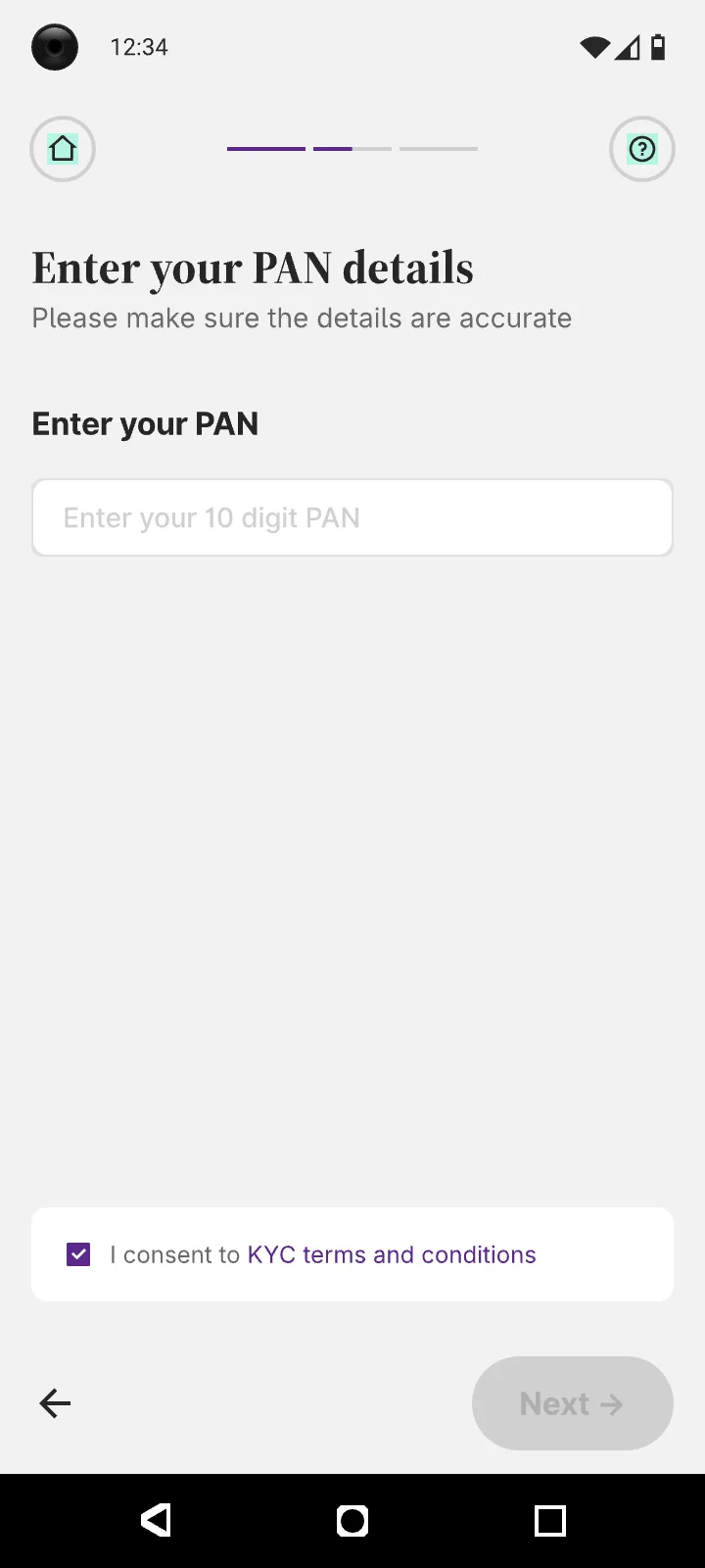
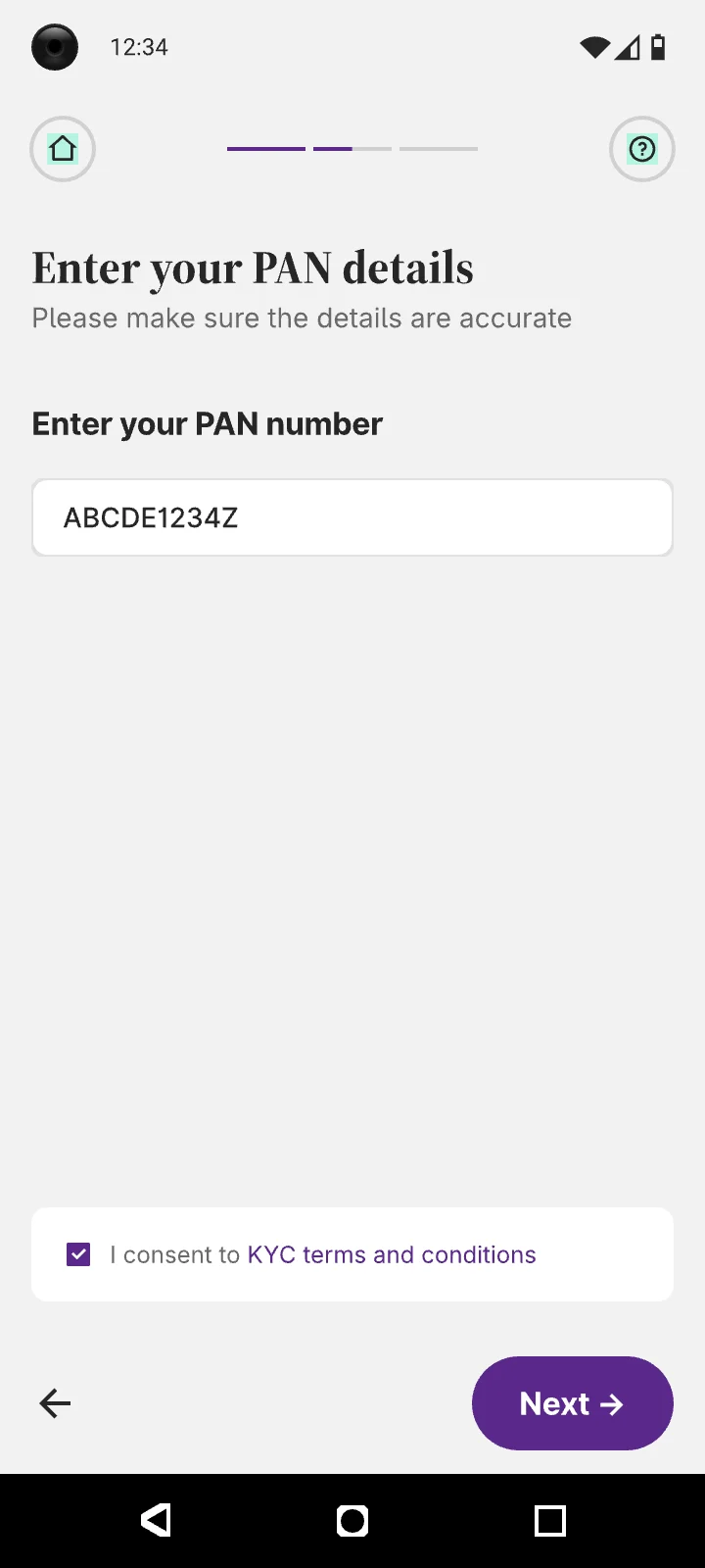
The 59% drop at PAN is an intent problem. When people sign up, they don’t expect to enter PAN details or do KYC.
are gone in the first three steps, so most starters never see bank verification. It rises to 72% for non-KRA users.
on and off the app weren’t recovering PAN drop-offs. It could be low trust, or no intent to continue.
at eSign is reasonable. People who get there are committed. The leak is much earlier.
The clicks that went nowhere
Session recordings told the same story. Dead clicks and rage clicks were 50% higher in Version 2.0. Hover a screen to see it clearly.
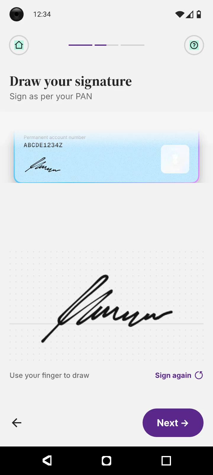
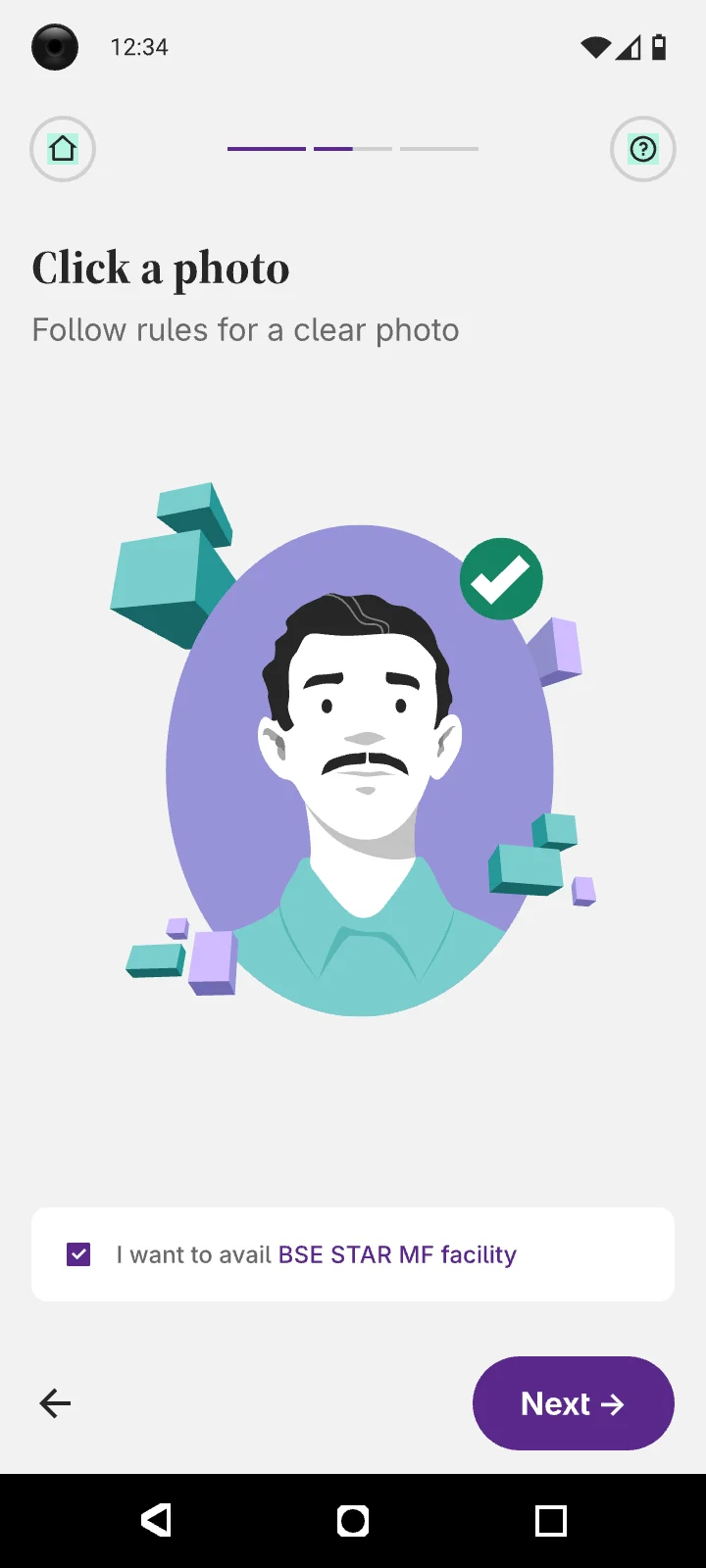
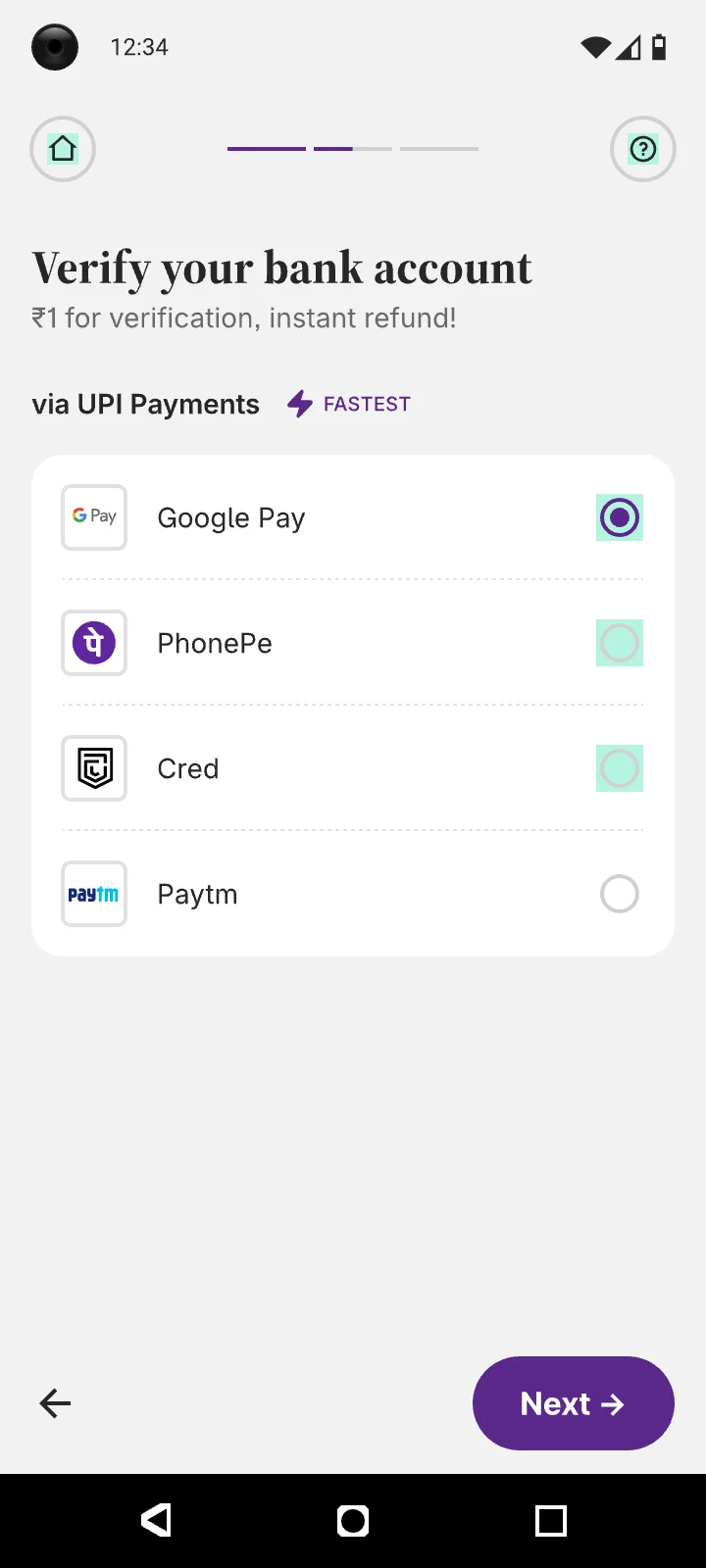
Eight other apps, timed end to end
Upstox was the slowest. The fastest fetched PAN and most of the profile from the phone number, so people only confirmed.
Each dial is 12 minutes. The solid wedge is the fastest time, the lighter wedge is the slowest.
[ 03 — Approach ]
Our approach
Fewer screens hadn’t meant less effort. So we ran two tracks: design fixes we could ship straight away and a vendor unlock that changed what the product could do.
Design fixes
Immediate changes with no external dependency
- OTP read and submitted automatically
- Multi-screen bank, personal and nominee forms merged into one
- Redundant priming screens removed
- Stepper screens replaced with a slim progress bar on top
- Nominee consent inline, not a full screen
- All declarations on a single page
- Segment activation and email verification moved after eSign, to reduce decision fatigue
Vendor unlock
With Ignosis, Equifax and Decentro, fetching from the mobile number
- The phone number alone can fetch PAN, bank and most personal details
- People move from typing everything to reviewing it, which saves time
- Fetched: PAN, name, father’s name, gender, address, bank and personal details
drop-offs. PAN details fetched from the mobile number.
drop-offs. Bank details fetched from the mobile number.
[ Visual concept ]
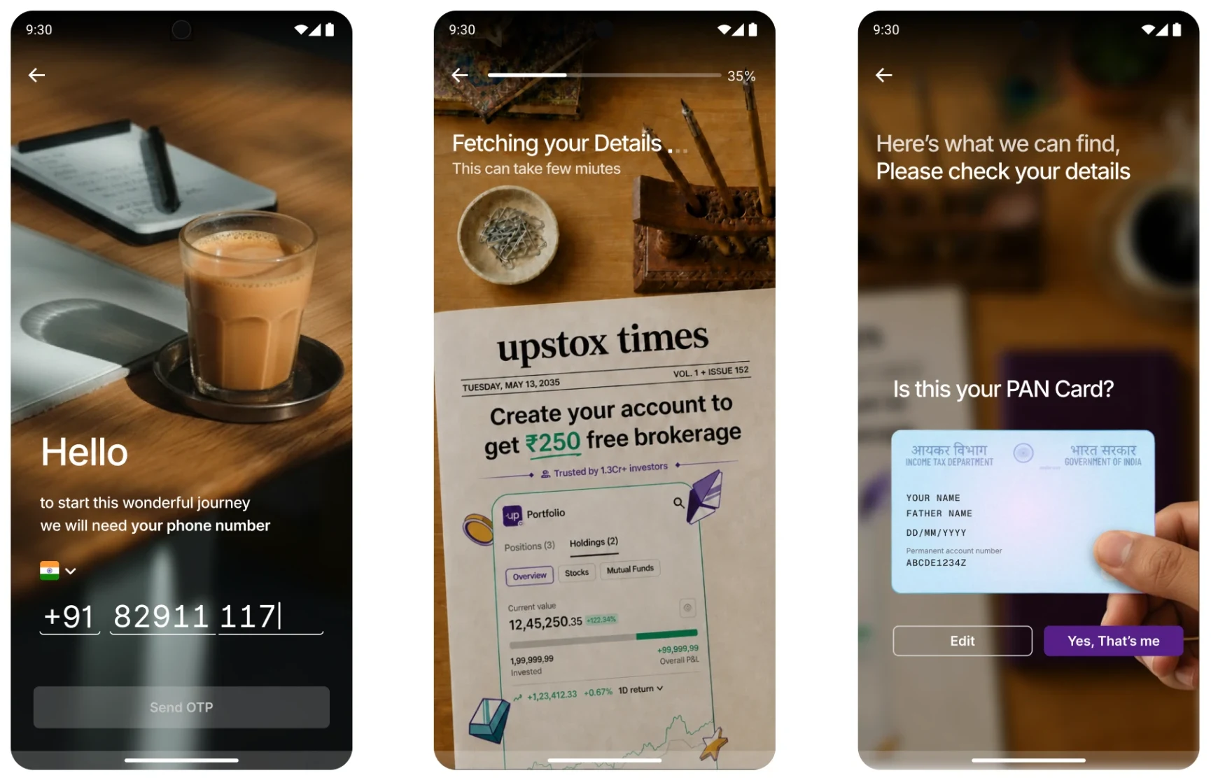
Borrowed from Upstox’s premium products. Built on top.
Leadership asked for a guided setup that felt light, not like a form. We took two concepts forward. The first won.
Glass, light and considered.
This visual language was already in our newer premium products. We took the cues and grew the system to carry the entire opening flow.
- Positioning, not paperworkA clear value proposition before any KYC.
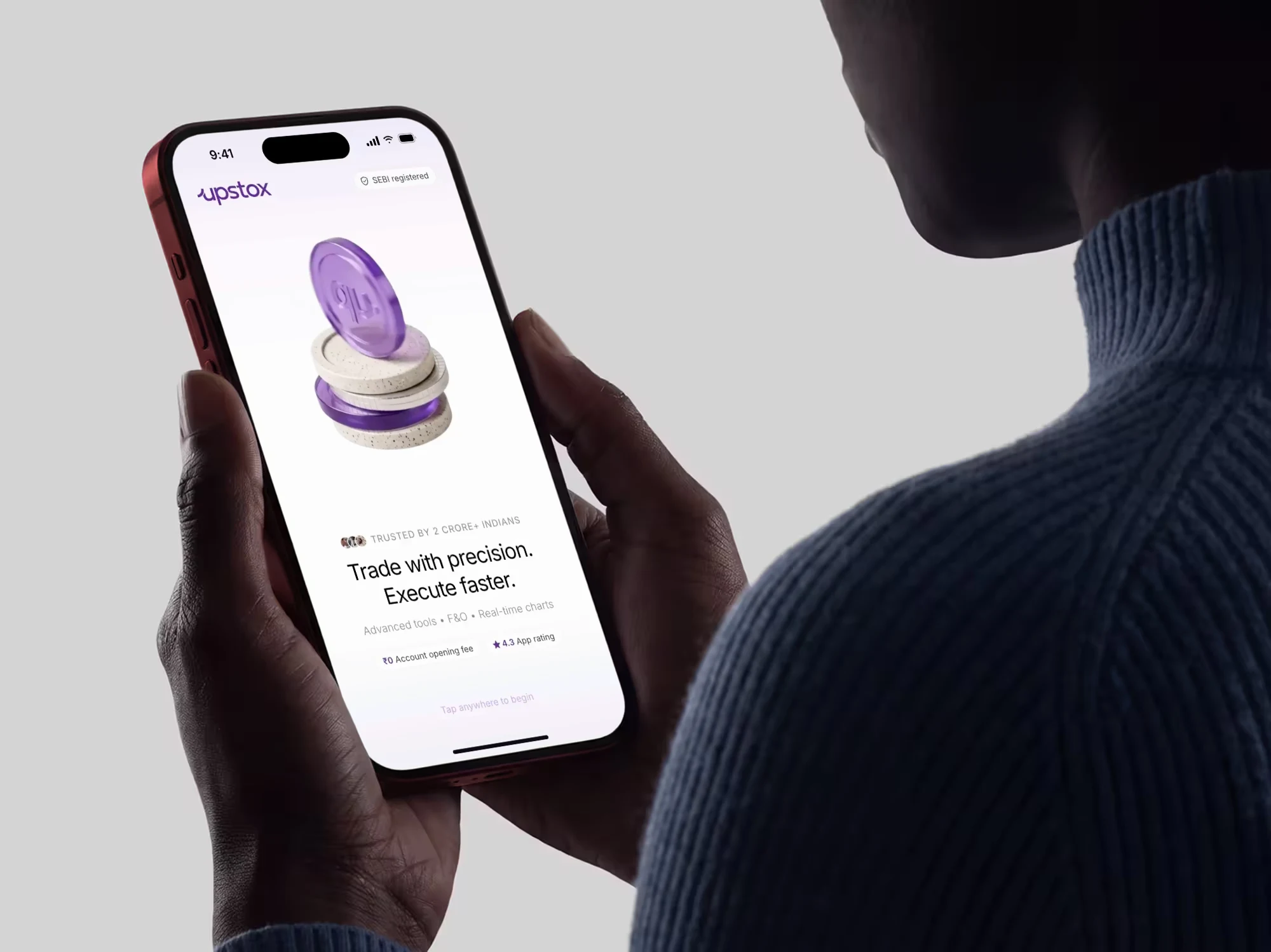
- Trust buildingA SEBI registration badge you see straight away.
- Social proof“Trusted by 2 Crore+ Indians” right on the welcome.
Borrowed from our user’s routine. Journey that feels relatable.
A story-led approach that feels like home: relatable, intuitive, deeply personal and made for every kind of India.
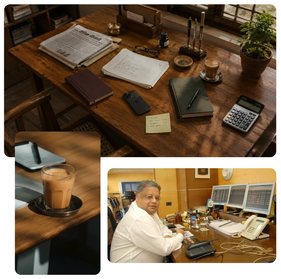
Not a process. A conversation.
Like stepping into a lobby so welcoming, you slow down on purpose. The kind you actually want to walk into.
Every element serves a purpose. No unnecessary distractions.
A real conversation. One that walks with you, not ahead of you.
[ The redesign ]
Six changes, each aimed at a specific kind of effort.
Give people a reason to start
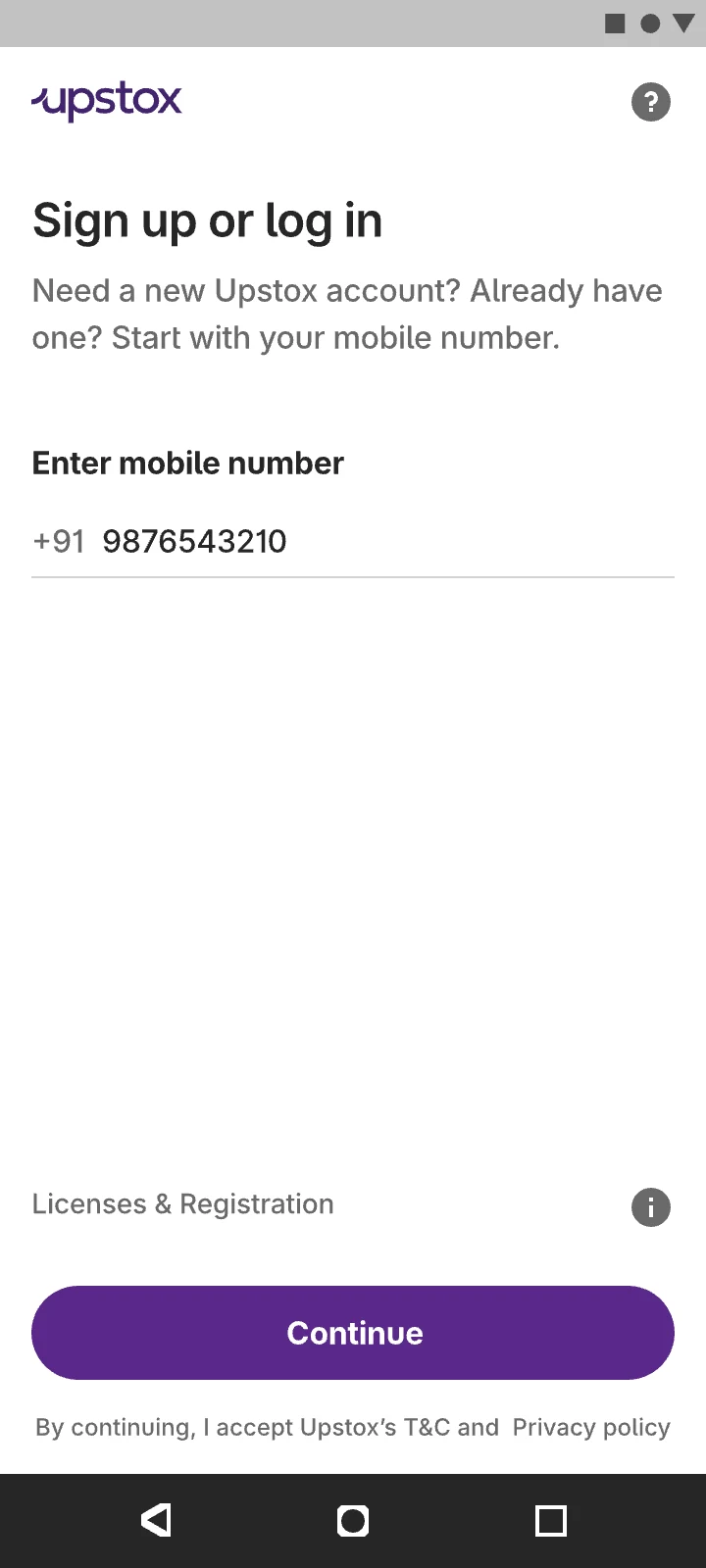
The first screen was a bare sign-up form, asking for KYC before saying anything about us.
A welcome that answers the first doubts: SEBI registered, ₹0 to open, rated 4.3.
Version 2.0
Version 3.0
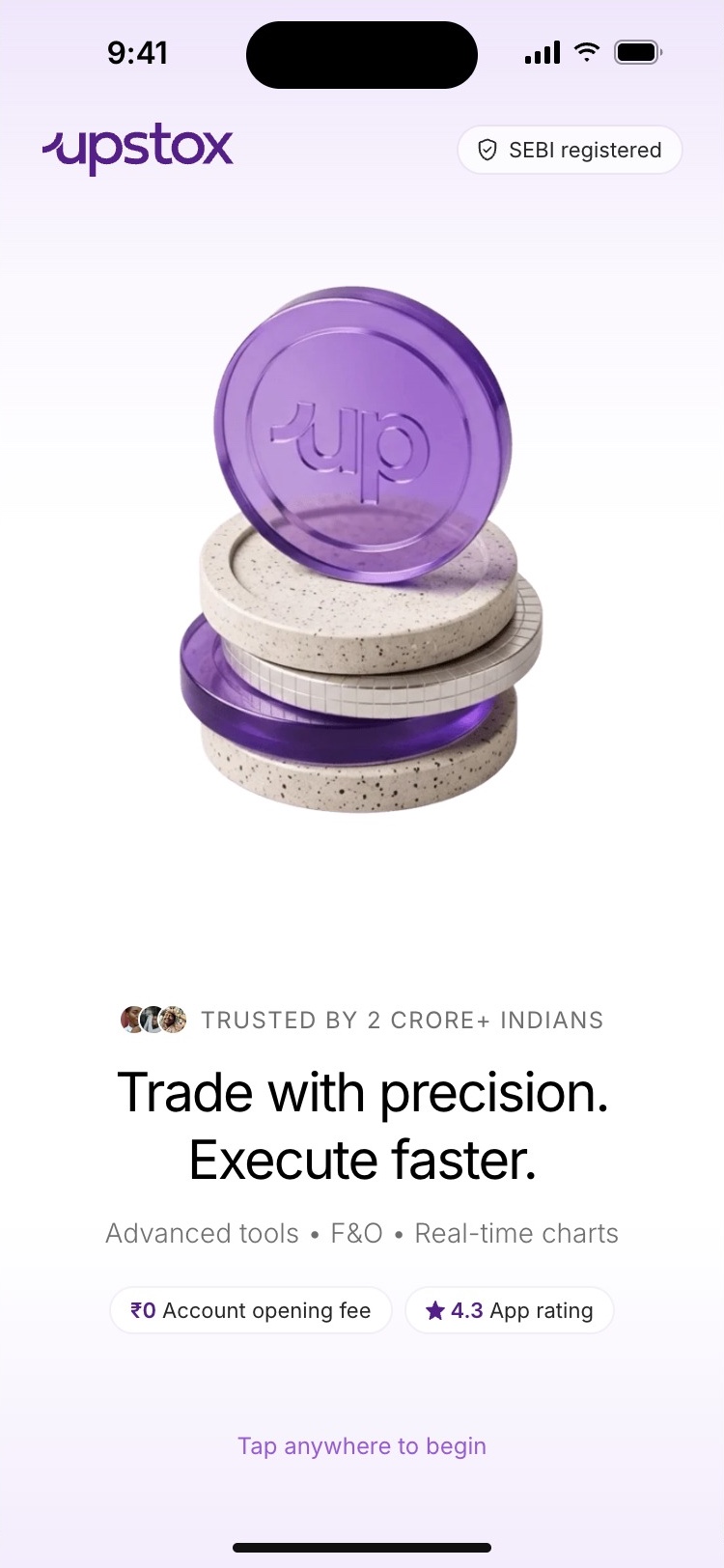
−16%drop-offs at PAN
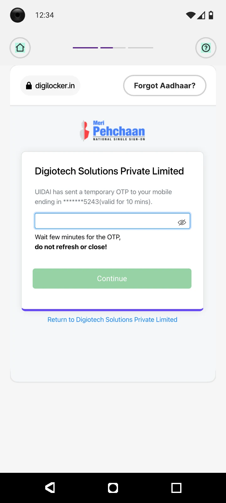
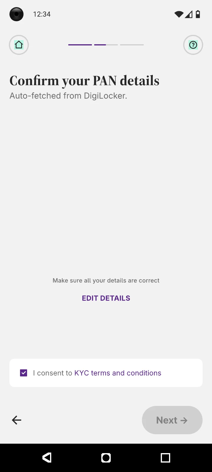
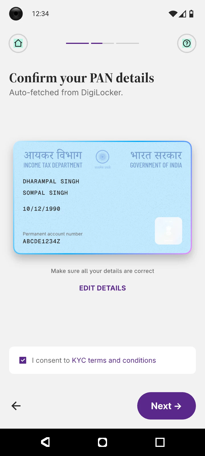
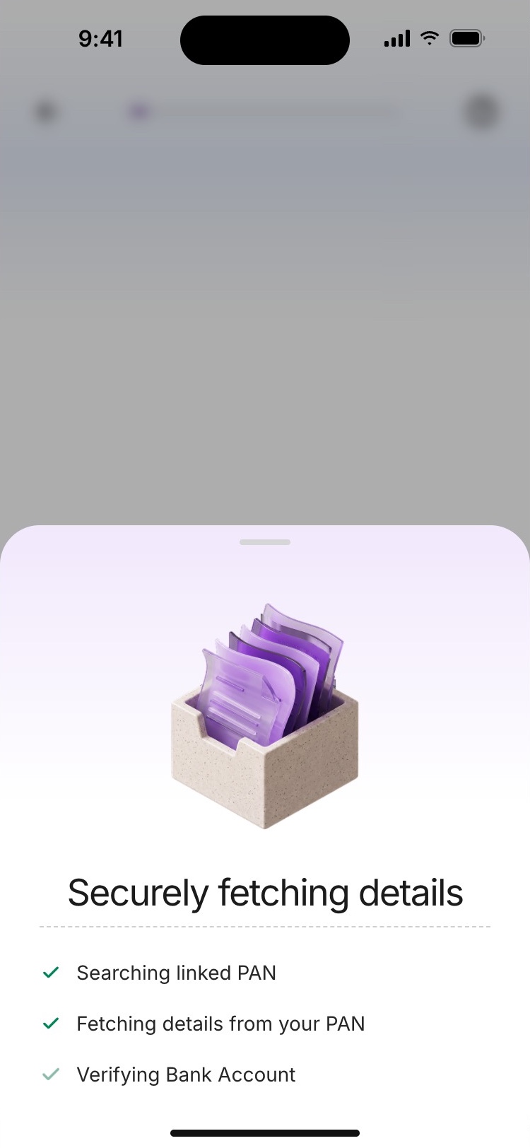
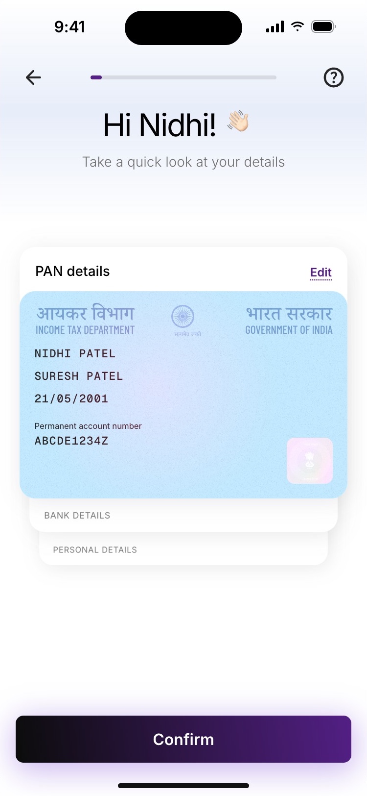
Turn PAN entry into a confirmation
59% of people left here. A primer, a DigiLocker login, then PAN details checked line by line.
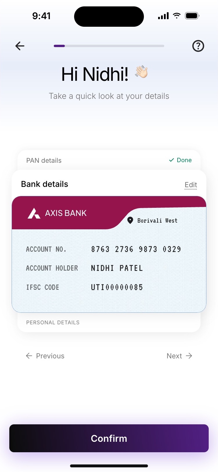
PAN is fetched from the mobile number and shown as a card to confirm. Edit stays one tap away.
Version 2.0
Version 3.0
−50%drop-offs at bank verification
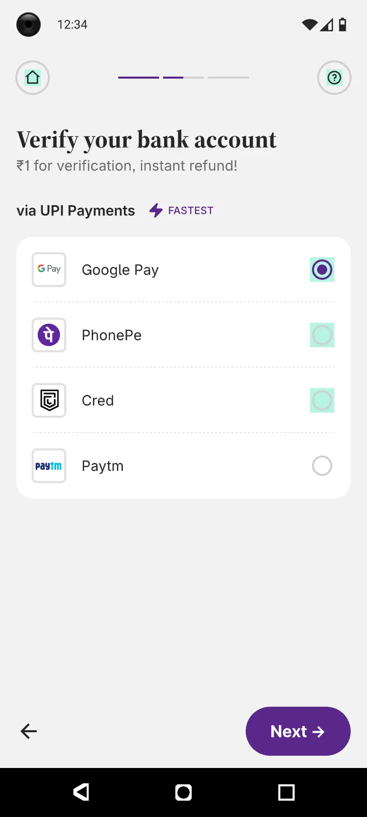
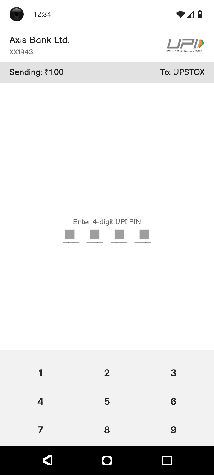
Remove the ₹1 bank payment
Leave the app, pay ₹1 over UPI, enter a PIN, wait for the refund.
Bank details are fetched and shown as a card under the PAN. Nobody leaves the app.
Version 2.0
Version 3.0
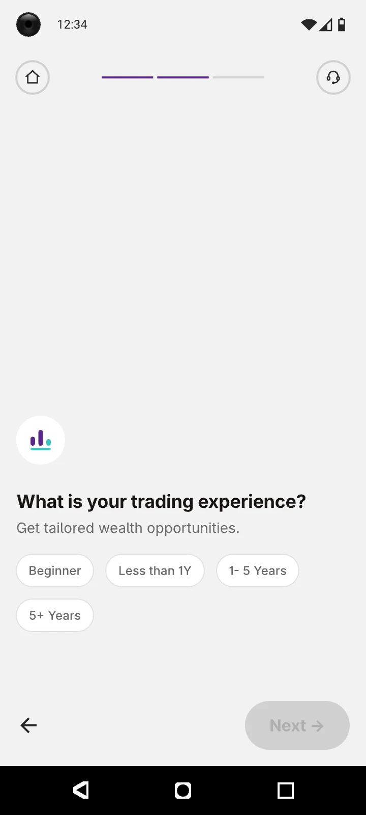
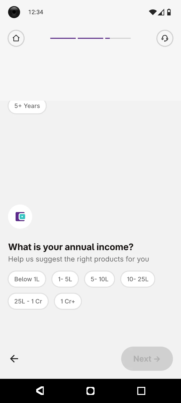
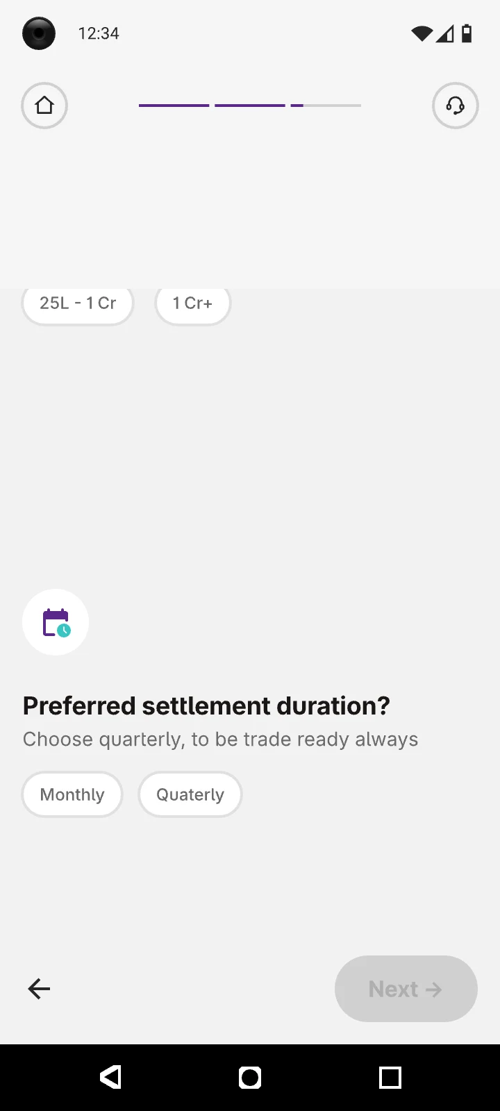
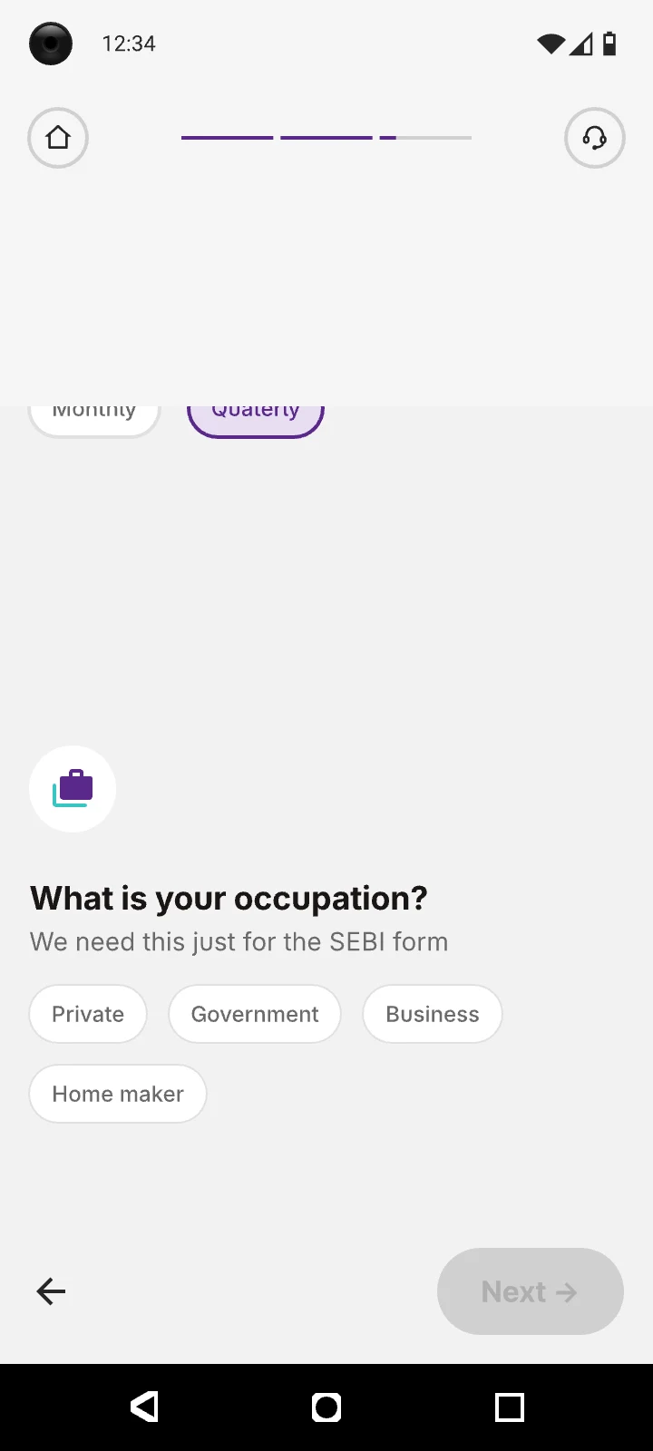
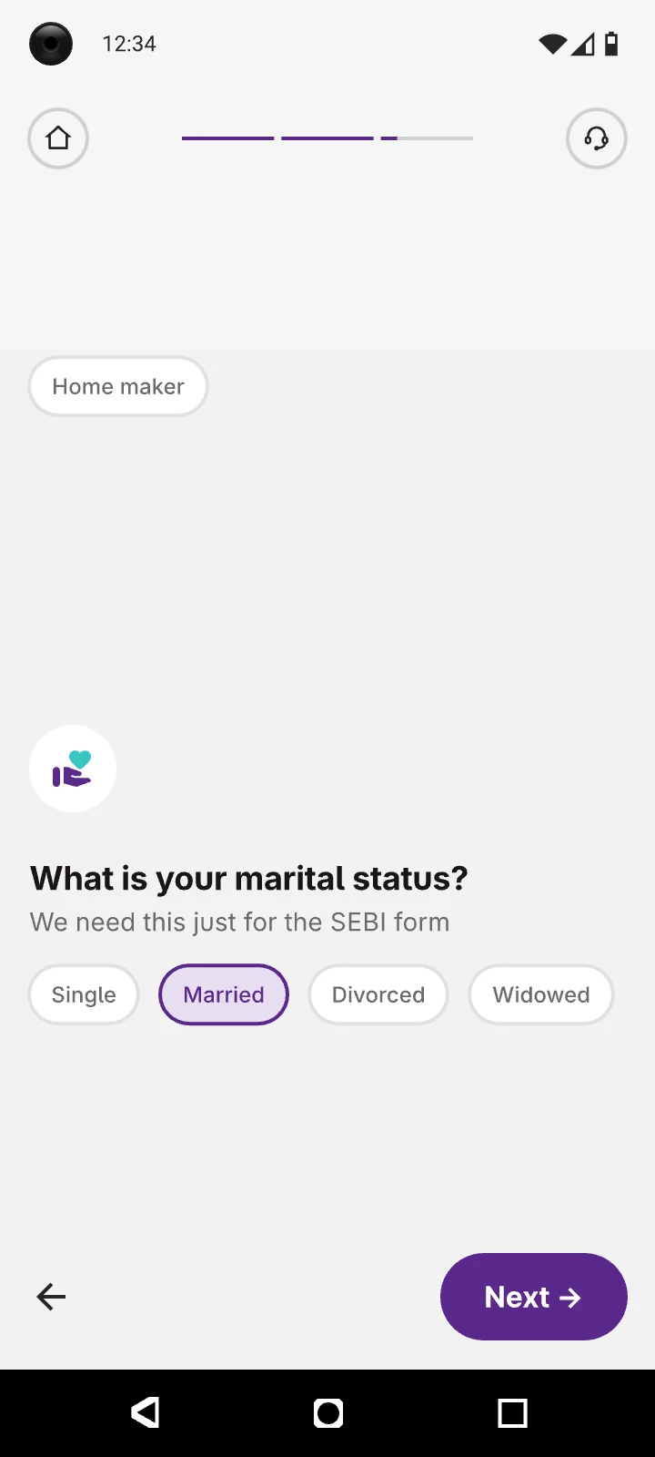
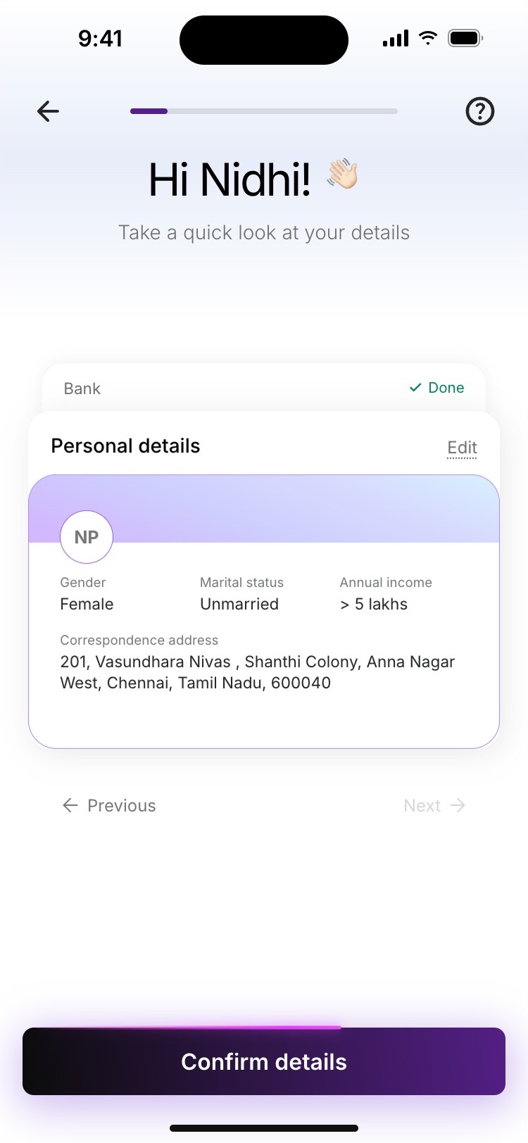
Bring personal details onto one screen
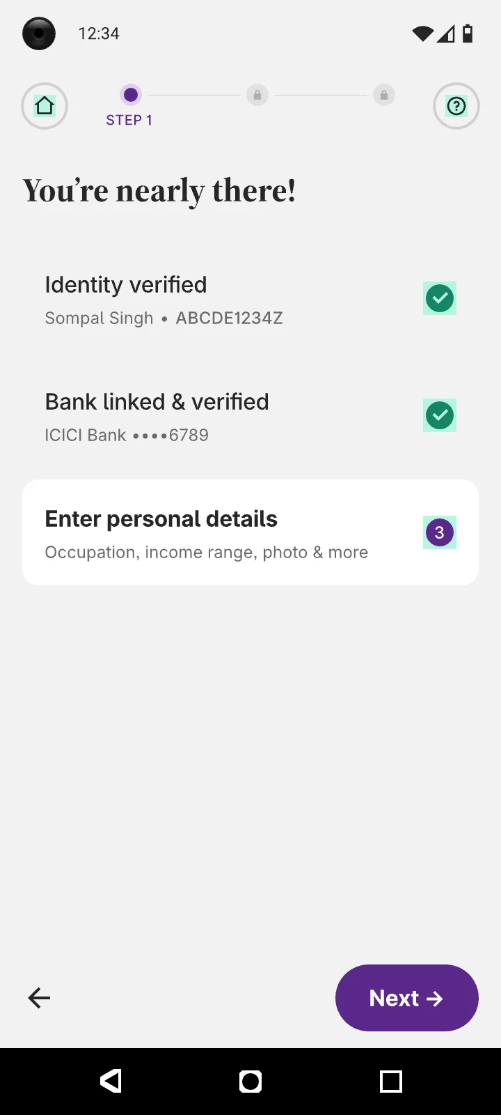
A primer and five single-question screens, for answers we mostly already had.
Fetched details arrive pre-filled on one card and confirmed sections stack up above it.
Version 2.0
Version 3.0
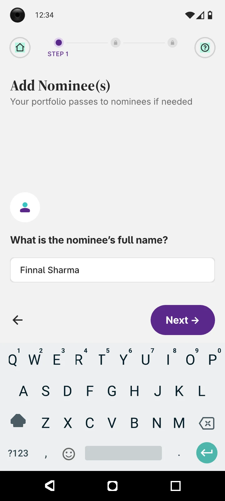
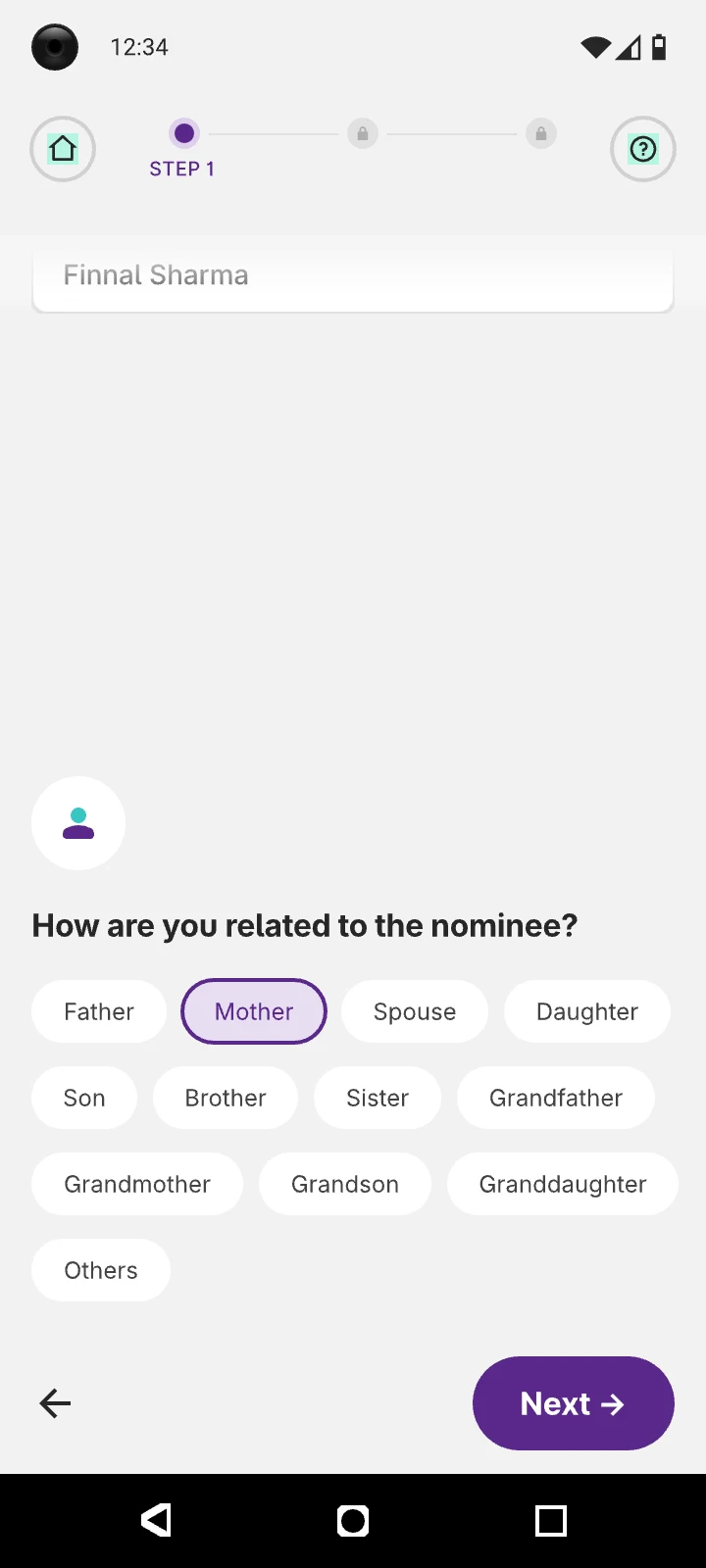
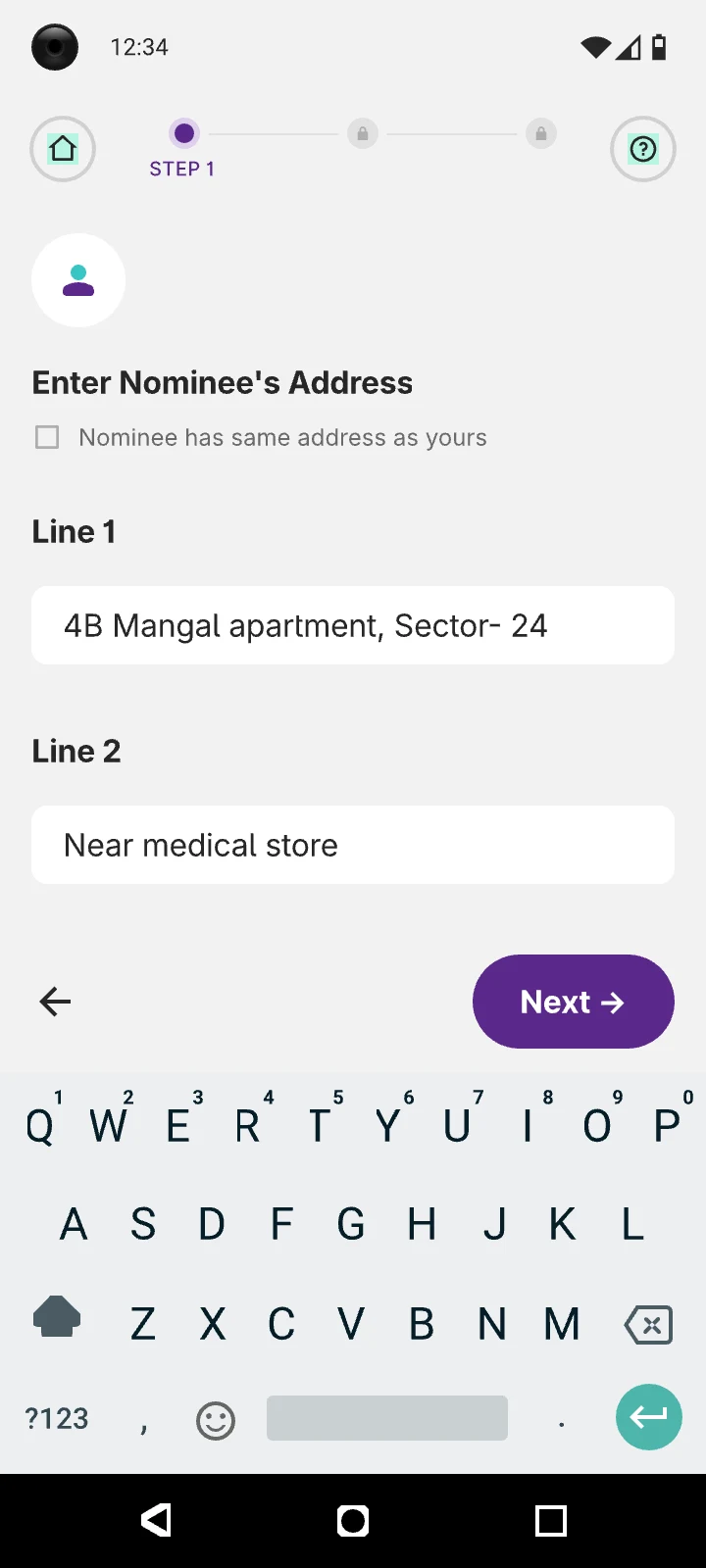
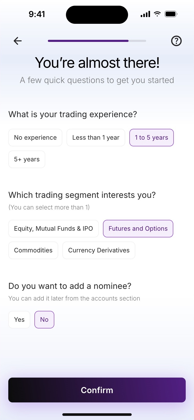
Take the nominee form out of the journey
Most people skip it, but saying yes opened up to 22 screens before the account.
The long form is gone from the flow. Nominee is now one yes-or-no question on the same screen as two others and can be added later from the accounts section.
Version 2.0
Version 3.0
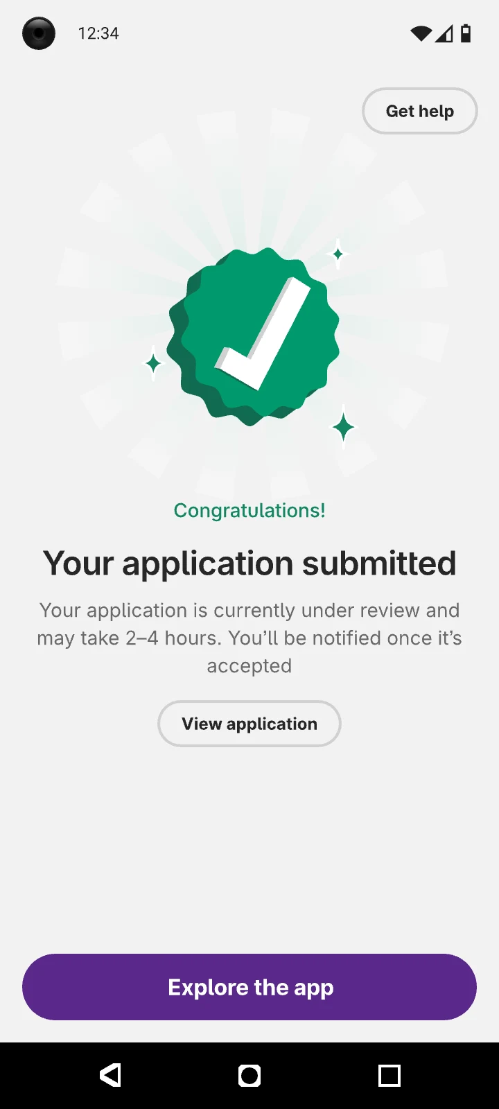
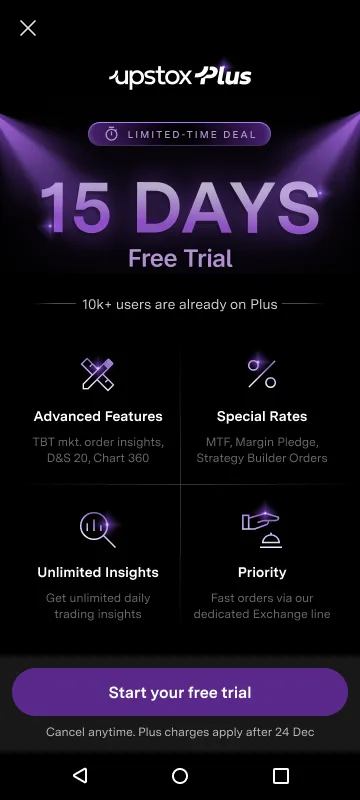
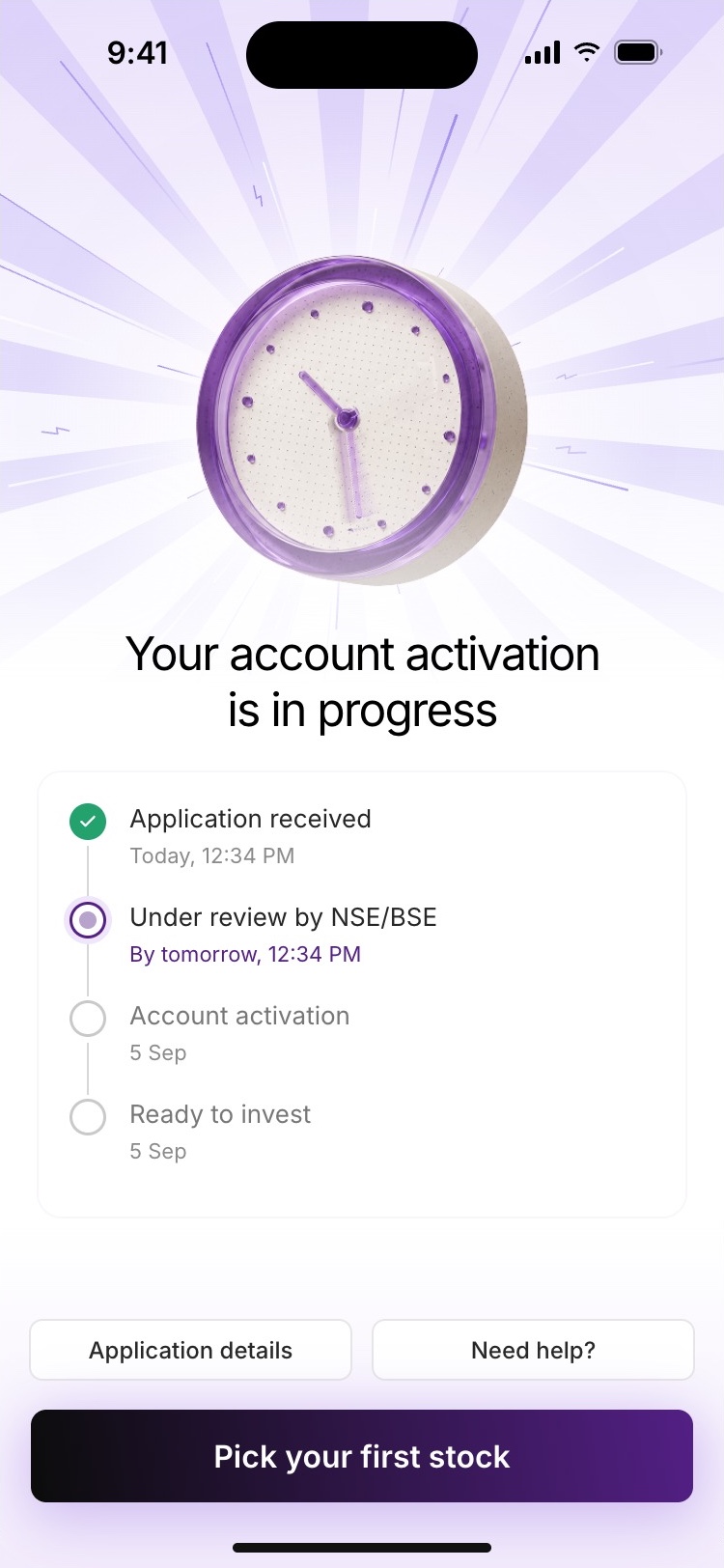
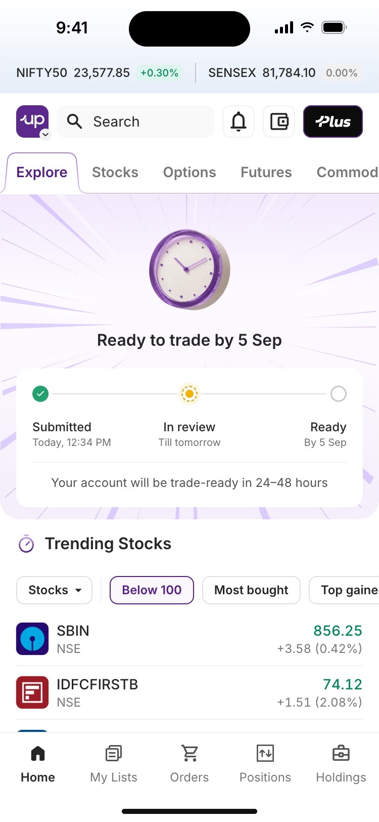
Make the end of KYC a starting point
A congratulations screen, then a Plus trial upsell, at a point where nobody could trade yet.
A live activation tracker, then a first watchlist to build while the account gets ready.
Version 2.0
Version 3.0
[ 04B — The whole journey ]
Sign-up to home, in one take.
Recorded from the prototype, at the pace someone would really go through it. Pause, skip, or jump to any step.
[ Prototype ]
Try it yourself.
The live prototype. Tap through the phone, or pick a path to see what happens when an auto-fetch fails.
[ Small moments ]
Delight is built in.
Delight is woven into every interaction from the very beginning. Every step is designed to reduce anxiety, build confidence and create moments of joy.
Micro-moments that compound into the feel
An onboarding experience that users actually look forward to completing.
[ 05 — The outcome ]
Fewer steps. Faster activation. More people finishing.
Version 3.0, released October 2026.
Time to open an account, on a 12-minute scale
The solid bar is the fastest time, the lighter bar is the slowest.
A leaner flow, with less friction at every stage of sign-up.
Down from 10–12 minutes.
Up 38% on Version 2.0.
[ The next step ]
Getting people through KYC was only half the job.
An open account and a first investment are two different things. Finishing KYC doesn’t mean someone knows what to do next, so Version 3.0 carries on past the last KYC step.
While the account activates, people build a watchlist. Once it’s ready, alerts on those stocks give them a reason to make a first trade. The same nudge setup can carry other prompts across the app.
[ Reflection ]
I stopped counting screens and started looking at effort.
A flow can have fewer screens and still be tiring. Sometimes a confirmation does more than a better form and sometimes the best thing to do with a screen is remove the reason it exists.
Not every fix here was a design fix. Auto-fetch did more for speed than any layout change and getting it in meant working with PMs and vendors, not just in Figma.
For an investing app, an open account isn’t the goal. It’s where investing starts.
[ Next case study ]
2026
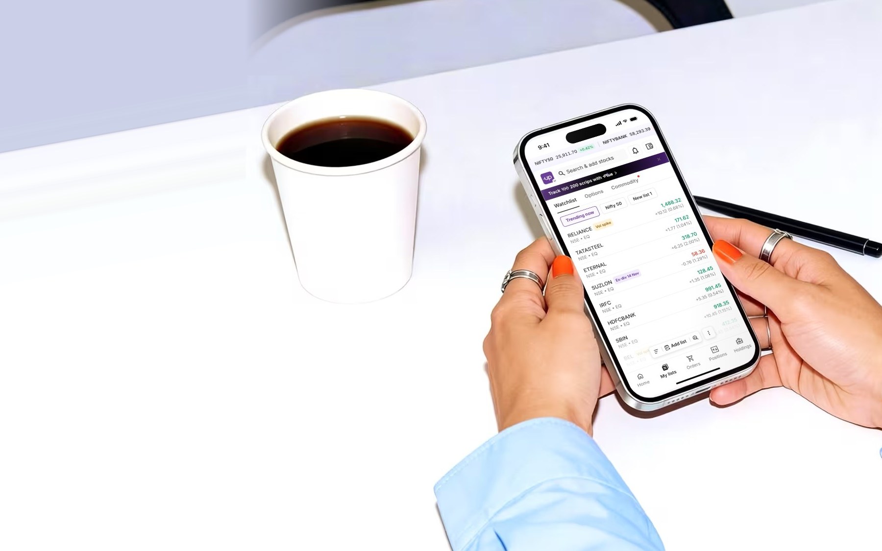
Watchlist redesign that drove 5.2× more orders
A three-release redesign of the Upstox Watchlist, shaped by trader research and product data.
- +420.8%
- Orders from Watchlist rows
- +2,038.2%
- New lists created
- +138%
- Watchlist tab opens